(日本語版はこちらへ)
Hello and Happy New Year! I'm Vincent (@vincentisambart) from the Mobile Infrastructure team here at Cookpad Japan.
Recently, Apple has been putting a lot of energy into SF Symbols, symbols to use on your app's screens. SF Symbols allows you to not only use symbols created by Apple, but also custom ones you made yourself. To create custom symbols, following the official workflow seemed quite time-consuming, so I tried to automatically generate custom symbols from existing SVG files instead.
How it started
For symbols, single color icons, the iOS Cookpad Japan app has been using CookpadSymbols, a font made only of symbols, for quite a while. However, a few months ago, our designers asked if we could switch from using a font to using SVG files.
The icons used in the font were already made from SVGs, but designers wanted to simplify the process, and not have to load the vector files into some online tool to generate a new version of the font every time a change was made. And these days SVG files can be used directly in a lot of places so that should be doable.
You can see how a few CookpadSymbols symbols look like below.

On iOS there are 3 different ways to use SVGs as symbols.
- Use them as pixel images of a specific size (as if they had been converted to PNG)
- Use them as vector data ("Preserve Vector Data" setting in asset catalogs)
- Starting from Xcode 12 you can use SVG files directly, but to use them as vector data on iOS 12 and below, it seems that you have to first convert them to PDF.
- Use them as custom symbols (custom SF Symbols)
- Requires iOS 13 and above.
The iOS Cookpad Japan app had been using symbols from a font, changing their displayed size depending on the screen, so using fixed size images would be pretty inconvenient. The source is a vector image so you can easily generate a lot of differently sized images, but still.
Apple has recently been pushing SF Symbols, and at the time our designers asked for switching from a symbol font, we were already talking about stopping support for iOS 12 very shortly after. So I decided to go for choice 3. If we ended up delaying stopping support for iOS 12 for a long period of time, or if implementation of that choice ended up being too complicated, I could always fall back to choice 2.
In the end, stopping support of iOS 12 was delayed a bit, but I still went to choice 3. Before explaining how the implementation went, we should probably have a better look at custom symbols.
Custom Symbols
To introduce custom symbols, we first have to talk about SF Symbols. SF Symbols is a feature available starting from iOS 13, providing symbols (one color icons that can be used at any size) that developers can use in their apps. In contrast with normal fixed size images, they are made to be used in conjunction with text: their size is specified with a font size, and their baseline can be properly aligned with text.
You can see a list and search through SF Symbols inside the SF Symbols app provided by Apple as you can see in the screenshot below.

You are not limited to the symbols provided by Apple, you can also use your own custom symbols. To make you own custom symbols, if you follow the official guide, you first have to choose in the SF Symbols app an existing symbol close to the one you want to make, and export it as SVG. You then edit it in a vector graphics editor (like Illustrator) to get a symbol usable in Xcode.
The existing symbol font CookpadSymbols had close to 300 symbols. Editing them one by one would take a lot of effort. We are trying to make life easier for designers, so giving them more work would not make much sense. Automation is a bit part of the job of developers, and after all SVG is XML, making it pretty malleable, so I started working on it.
Trying to load an existing SVG into Xcode
The SVG files were already prepared by designers (by the way those SVGs are also used on the Web and Android). You can see one of those SVGs below (no need to try to understand the content in detail).
<svg height="64" width="64" xmlns="http://www.w3.org/2000/svg" viewBox="0 0 64 64"><circle cx="32" cy="12" r="8"/><path d="M52.7 50.941l-7.913-4.396-3.335-8.34-.642-8.994 3.257.723 1.517 6.826a3.504 3.504 0 004.176 2.658 3.5 3.5 0 002.658-4.176l-2-9a3.5 3.5 0 00-2.658-2.658l-9-2a3.416 3.416 0 00-1.276-.037c-.16-.022-.319-.047-.484-.047h-8c-.163 0-.32.031-.479.055a3.48 3.48 0 00-3.254 1.26l-7.163 8.953-4.679.781a3.501 3.501 0 001.15 6.904l6-1a3.513 3.513 0 002.158-1.266l4.18-5.225 1.346 6.279-6.126 8.752A3.503 3.503 0 0021.5 49v9a3.5 3.5 0 107 0v-7.896l5.322-7.604h1.808l3.12 7.801a3.51 3.51 0 001.55 1.76l9 5a3.5 3.5 0 004.759-1.36 3.5 3.5 0 00-1.359-4.76z"/></svg>
If you try loading it in a web browser or vector graphics editor, you get this.

Xcode 12 can read SVGs, so without thinking too much, if you try to drag & drop the same file in an asset catalog, you get the following.

Pretty different to the expected result... Looking at the content of the SVG, the file content seemed optimized (not containing any non-required information), so I thought the file not appearing correctly might be due to Xcode not handling that type of optimized SVG properly. Looking more closely at the content, even though it seems optimized, in path, having some numbers starting with 0s looked unnatural to me (for example 004.176). It is just a text (XML) file, so after having a quick look at the SVG specs, I loaded the SVG in a text editor, and tried adding spaces after each of those unnatural 0s (for example 004.176→0 0 4.176). Loading the modified file into Xcode gave the following.

Not perfect yet, but still better than we had before. So it seems that Xcode's SVG parsing is indeed a bit limited.
Compensating for Xcode's poor understanding of the SVG format would require spending time to learn and understand the SVG specs, so before even thinking of trying that, first isn't there a tool that would do it for us?
Looking at the repository for the SVGs that the designers had created, it seemed they were using a tool called SVGO for optimizing the SVGs. Looking at that tool's settings, there was a path-related setting that looked related. After adding the 2 lines below to the already existing svgo.yml setting file, and then running SVGO, all updated SVGs could now be properly loaded into Xcode.
  - convertPathData:
      # Xcode doesn't handle properly paths without spaces after flags
      noSpaceAfterFlags: false

SVG being loaded properly with only setting change was a relief.
With the new settings, the SVG files became a tiny bit bigger due to the added spaces, but using different settings depending on the platform would be cumbersome, so we chose to use these settings for all platforms.
Being able to read these SVGs into Xcode was an important first step, but we want to handle them not as normal images but as symbols, so we now have to prepare symbols from these SVGs.
Providing symbols
Following the official guide, providing symbols first requires to export an existing symbol from the SF Symbols app. If you export what seems to be one of the simplest symbols circle, you get an SVG that looks like the following.
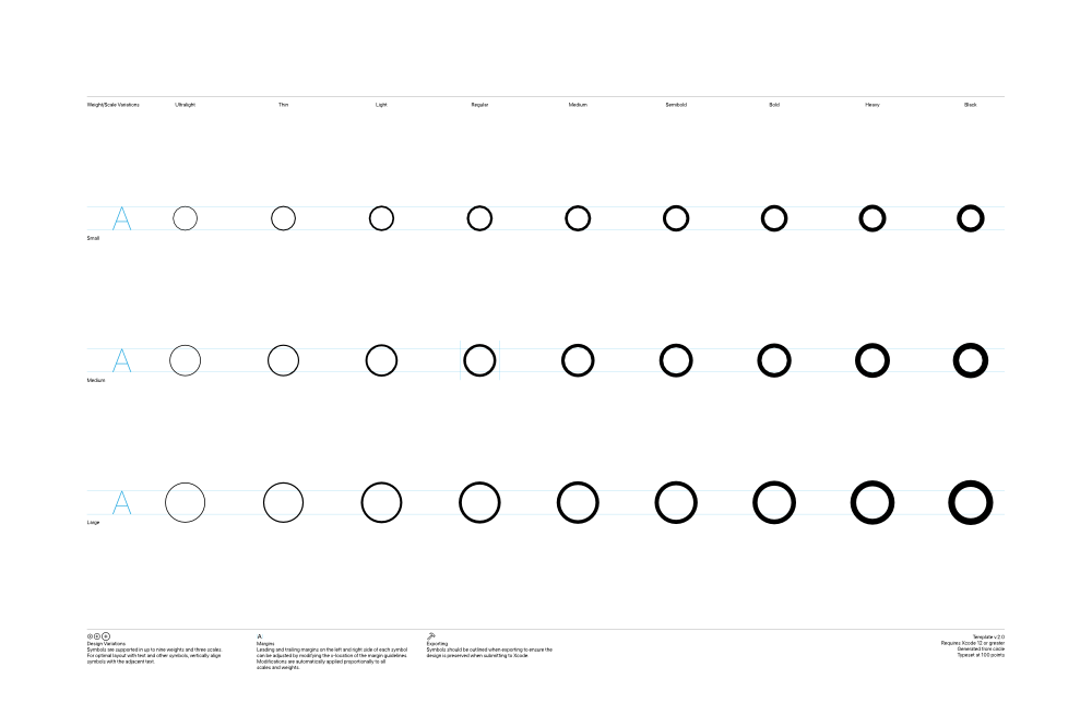
For one symbol you can provide 3 sizes and 8 weights, and providing all of them would probably be the best, but reading the official guide, only Regular Medium (Regular-M) is required. I chose to only provide the required shape at first. If providing other sizes just requires some simple scaling, generating other sizes afterwards should be pretty easy.
The goal was to make managing symbols easy, so I decided to insert the SVGs' content into a template exported from the SF Symbols app, not by hand as the guide said, but automatically with a script. I wrote that script in Ruby as that was the easiest for me, but you should be able to do it pretty easily in any language with a good XML handling library. I tried making the code below simple and added many comments, so you should be able to follow along without knowing much Ruby. In the code I'm using CSS selectors as much as possible (#abcd points to nodes in the XML for which id is abcd).
We first start with a simple setup. Load the library we are going to use, define constants, and load the template.
require "nokogiri" # Load the XML library we are going to use.

# Path to file exported from the SF Symbols app
TEMPLATE_PATH = "path/to/circle.svg"
# Path to one of the SVGs provided by the designers
SOURCE_SVG_PATH = "icon.svg"
# Path to the SVG we are generating
DESTINATION_SVG_PATH = "icon-symbol.svg"

# Expected icon size
ICON_WIDTH = 64
ICON_HEIGHT = 64
# Additional scaling to have a size closer to Apple's provided SF Symbols
# (I just tried different values and that looked pretty close)
ADDITIONAL_SCALING = 1.7
# Width of #left-margin and #right-margin inside the SVG
MARGIN_LINE_WIDTH = 0.5
# Additional white space added on each side
ADDITIONAL_HORIZONTAL_MARGIN = 4

# Load the template.
template_svg = File.open(TEMPLATE_PATH) do |f|
  # To generate a better looking SVG, ignore whitespaces.
  Nokogiri::XML(f) { |config| config.noblanks }
end
The template is an XML (SVG) split into 3 groups (#Notes, #Guides, #Symbols).
<?xml version="1.0" encoding="UTF-8"?>
<!--Generator: Apple Native CoreSVG 149-->
<!DOCTYPE svg
PUBLIC "-//W3C//DTD SVG 1.1//EN"
       "http://www.w3.org/Graphics/SVG/1.1/DTD/svg11.dtd">
<svg version="1.1" xmlns="http://www.w3.org/2000/svg" xmlns:xlink="http://www.w3.org/1999/xlink" width="3300" height="2200">
 <!--glyph: "uni100000.medium", point size: 100.000000, font version: "Version 16.0d18e1", template writer version: "8"-->
 <g id="Notes">
  (...)
 </g>
 <g id="Guides">
  (...)
 </g>
 <g id="Symbols">
  (...)
 </g>
</svg>
The symbols are included into the #Symbols as you can see below.
 <g id="Symbols">
  <g id="Black-L" transform="matrix(1 0 0 1 2854.05 1556)">
   <path d="(...)"/>
  </g>
  <g id="Heavy-L" transform="matrix(1 0 0 1 2558.39 1556)">
   <path d="(...)"/>
  </g>
  <g id="Bold-L" transform="matrix(1 0 0 1 2262.88 1556)">
We will not provide symbols other than #Regular-M so we have to remove the other ones.
TEMPLATE_ICON_SIZES = ["S", "M", "L"]
TEMPLATE_ICON_WEIGHTS = ["Black", "Heavy", "Bold", "Semibold", "Medium", "Regular", "Light", "Thin", "Ultralight"]

# We are only providing "Regular-M", so remove the other shapes.
TEMPLATE_ICON_SIZES.each do |size|
  TEMPLATE_ICON_WEIGHTS.each do |weight|
    id = "#{weight}-#{size}"
    next if id == "Regular-M" # Only leave the mandatory shape.
    template_svg.at_css("##{id}").remove
  end
end
The #Notes group is mostly text to see in a vector graphics editor.
<g id="Notes"> <rect height="2200" id="artboard" style="fill:white;opacity:1" width="3300" x="0" y="0"/> <line id="" style="fill:none;stroke:black;opacity:1;stroke-width:0.5;" x1="263" x2="3036" y1="292" y2="292"/> <text style="stroke:none;fill:black;font-family:-apple-system,"SF Pro Display","SF Pro Text",Helvetica,sans-serif;font-weight:bold;" transform="matrix(1 0 0 1 263 322)">Weight/Scale Variations</text> <text style="stroke:none;fill:black;font-family:-apple-system,"SF Pro Display","SF Pro Text",Helvetica,sans-serif;text-anchor:middle;" transform="matrix(1 0 0 1 559.711 322)">Ultralight</text> (...) <text id="template-version" style="stroke:none;fill:black;font-family:-apple-system,"SF Pro Display","SF Pro Text",Helvetica,sans-serif;text-anchor:end;" transform="matrix(1 0 0 1 3036 1933)">Template v.2.0</text> (...) </g>
From its name, it looks like #Notes could be removed without any problem, but in fact if you read the official documentation properly, it tells you that the #template-version text node inside #Notes is important. If you remove it, the position of left and right margins and the horizontal position of the shape inside those margins will be ignored. It is also recommended to not remove #artboard.
If you really want to remove all unneeded nodes, removing child nodes of #Notes that have no id or an empty one might be OK.
Below the #Notes group, there is a very important #Guides group.
 <g id="Guides">
  (...)
  <line id="Baseline-S" style="fill:none;stroke:#27AAE1;opacity:1;stroke-width:0.5;" x1="263" x2="3036" y1="696" y2="696"/>
  <line id="Capline-S" style="fill:none;stroke:#27AAE1;opacity:1;stroke-width:0.5;" x1="263" x2="3036" y1="625.541" y2="625.541"/>
  (...)
  <line id="Baseline-M" style="fill:none;stroke:#27AAE1;opacity:1;stroke-width:0.5;" x1="263" x2="3036" y1="1126" y2="1126"/>
  <line id="Capline-M" style="fill:none;stroke:#27AAE1;opacity:1;stroke-width:0.5;" x1="263" x2="3036" y1="1055.54" y2="1055.54"/>
  (...)
  <line id="left-margin" style="fill:none;stroke:#00AEEF;stroke-width:0.5;opacity:1.0;" x1="1391.3" x2="1391.3" y1="1030.79" y2="1150.12"/>
  <line id="right-margin" style="fill:none;stroke:#00AEEF;stroke-width:0.5;opacity:1.0;" x1="1508.39" x2="1508.39" y1="1030.79" y2="1150.12"/>
 </g>
We are only providing a Regular-M symbol, so its vertical position between #Baseline-M and #Capline-M, and its horizontal position between #left-margin and #right-margin, are important. So we want to get the position of each of those guides.
By the way, as symbols have been designed to be used in conjunction with text, capline and baseline are typography terms. That is why if you look at the image of the template I included above, on the left side you have an A to be used as a reference.
def get_guide_value(template_svg, axis, xml_id)
  guide_node = template_svg.at_css("##{xml_id}")
  raise "invalid axis" unless %i{x y}.include?(axis)
  val1 = guide_node["#{axis}1"]
  val2 = guide_node["#{axis}2"]
  if val1 == nil || val1 != val2
    raise "invalid #{xml_id} guide"
  end
  val1.to_f # Convert the value from string to float.
end

# Get the x1 (should be the same as x2) of the #left-margin node.
original_left_margin = get_guide_value(template_svg, :x, "left-margin")
# Get the x1 (should be the same as x2) of the #right-margin node.
original_right_margin = get_guide_value(template_svg, :x, "right-margin")
# Get the y1 (should be the same as y2) of the #Baseline-M node.
baseline_y = get_guide_value(template_svg, :y, "Baseline-M")
# Get the y1 (should be the same as y2) of the #Capline-M node.
capline_y = get_guide_value(template_svg, :y, "Capline-M")
We then load the SVG icon and check if it has the expected size.
# Load the SVG icon.
icon_svg = File.open(SOURCE_SVG_PATH) do |f|
    # To generate a better looking SVG, ignore whitespaces.
  Nokogiri::XML(f) { |config| config.noblanks }
end

# The SVGs provided by designers had a fixed size of 64x64, so all the calculations below are based on this.
# If we get an unexpected size, the program ends in error.
# The SVG specs allows to specify width and height in not only numbers, but also percents, so handling a wider range of SVG files would be more complicated.
if icon_svg.root["width"] != ICON_WIDTH.to_s ||
  icon_svg.root["height"] != ICON_HEIGHT.to_s ||
  icon_svg.root["viewBox"] != "0 0 #{ICON_WIDTH} #{ICON_HEIGHT}"
  raise "expected icon size of #{icon.source_svg_path} to be (#{ICON_WIDTH}, #{ICON_HEIGHT})"
end
We then have to scale the provided icon to match the template.
The position of the left and right margins depend on the symbol chosen in the SF Symbols app, but #Baseline-M and #Capline-M are always at the same position, so we scale based on the spacing between those 2 guides.
scale = ((baseline_y - capline_y).abs / ICON_HEIGHT) * ADDITIONAL_SCALING
horizontal_center = (original_left_margin + original_right_margin) / 2

scaled_width = ICON_WIDTH * scale
scaled_height = ICON_HEIGHT * scale

# If you use the template's margins as-is, the generated symbol's width will depend on the template chosen.
# To not have to care about the template, we move the margin based on the computed symbol size.
horizontal_margin_to_center = scaled_width / 2 + MARGIN_LINE_WIDTH + ADDITIONAL_HORIZONTAL_MARGIN
adjusted_left_margin = horizontal_center - horizontal_margin_to_center
adjusted_right_margin = horizontal_center + horizontal_margin_to_center
left_margin_node = template_svg.at_css("#left-margin")
left_margin_node["x1"] = adjusted_left_margin.to_s
left_margin_node["x2"] = adjusted_left_margin.to_s
right_margin_node = template_svg.at_css("#right-margin")
right_margin_node["x1"] = adjusted_right_margin.to_s
right_margin_node["x2"] = adjusted_right_margin.to_s
We finished all our calculations, so we then insert the loaded icon at the correct position and size in the adjusted template, and generate a complete symbol file.
# Make a copy of the modified template.
# In this script we generate only one symbol, but if we end up generating multiple symbols at one it's safer to work on a copy.
symbol_svg = template_svg.dup

# It's finally time to handle that important #Regular-M node.
regular_m_node = symbol_svg.at_css("#Regular-M")

# Move the shape so its center is at the center of the guides.
translation_x = horizontal_center - scaled_width / 2
translation_y = (baseline_y + capline_y) / 2 - scaled_height / 2
# Prepare a transformation matrix from the values calculated above.
transform_matrix = [
  scale, 0,
  0, scale,
  translation_x, translation_y,
].map {|x| "%f" % x } # Convert numbers to strings.
regular_m_node["transform"] = "matrix(#{transform_matrix.join(" ")})"

# Replace the content of the #Regular-M node with the icon.
regular_m_node.children = icon_svg.root.children.dup

# Finish by writing the generated symbol to disk.
File.open(DESTINATION_SVG_PATH, "w") do |f|
  symbol_svg.write_to(f)
end
Problems that happened during implementation
Ending up with the code above required of course a lot of trial and error. Execute the script, check in a vector graphics editor and Xcode, update the script, and repeat. In the later stages, checking in Xcode was not only checking how the symbol appeared inside an asset catalog, but also trying to use the symbol in an Xcode project.
One problem that happened when I tried generating symbols from different provided SVGs, in some generated symbol files, on the side of the main shape there was some other shape. Looking a bit more at it, in some of the provided SVGs, there was a shape outside of the (0, 0, 64, 64) frame. In the source SVGs, viewport being 0 0 64 64 hid everything outside, so nobody realized that some other shape was left outside the frame. After I pointed it out the designers kindly removed those.
Another problem that I mentioned above in the implementation explanation, I first mistakenly thought #Notes could be freely removed. But if you remove that node, where you put the shape horizontally between the left and right margin, and the width between left and right margins, seem to have no effect on the generated symbol. After fixing the code to keep #Notes's children nodes with an "id" attribute (especially the #template-version node), the behavior matched my expectations.
Good and bad of fixed width
The symbols generated with the script above can be used without problem once added in an asset catalog. However, all the generated symbols have the same width, and that has its goods and bads. Even if our shapes here all fit in the same (0, 0, 64, 64) frame, the shapes themselves have different widths: the whitespace on the left and right inside that frame change depending on the symbol. iOS's custom symbols can use a different width for each symbol, and in Apple's SF Symbol multiple widths are used. The main reasons I went for a fixed width are the following.
- When placing multiple symbols inside the same screen, having them all have the same width simplifies the layout.
- Analyzing the shapes and calculating their real width is more complicated, and requires more hand-checking of the generated symbols. Also, if you start on that path, there's the problem that the real size of a shape and the size your eyes see (optical size) tend to be a bit different, and you start to want to be able to adjust sizes and margins per symbol.
What you choose depends on your use case, but I decided to go simple.
By the way, the width is the same for all symbols, but for some reason images generated from them have a width varying by 0.5~1.0 pts depending on the symbol. iOS 14 seems better in that regard, but it does happen even on iOS 14. I guess if you want something pixel perfect, you should probably use pixel images rather than vector ones...
A bit more convenience
For simplicity, the script above only processes one SVG. The internal script I wrote is a bit more powerful.
Its source is not only one file, but all SVG files in a specific directory, and generates a full asset catalog (xcassets directory), and also a Swift enum with the list of all the symbols.
In fact the format of an asset catalog is very simple. Also, in asset catalogs, a folder with the "Provides Namespace" checkbox checked providing a namespace is pretty convenient.
The generated enum looks like the following.
public enum CookpadSymbol: String, CaseIterable {
    public enum Package {
        // Namespace where the custom symbols are in the asset catalog
        public static let namespace = "cookpad"
        public static let version = "2.0.0"
    }

    case access
    case clip
    case clipAdd = "clip_add"
    case clipAdded = "clip_added"
    case clipRemove = "clip_remove"
    case lock

    // Name inside the asset catalog
    public var imageName: String { "\(Package.namespace)/\(rawValue)" }
}
How to use custom symbols
It's nice to have generated those symbols, but once you added them to an asset catalog, how can you use them?
UIImageView
To display a custom symbol, you generally use a UIImageView.
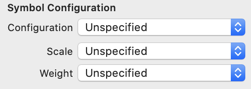
let symbolIconView = UIImageView()
// CookpadSymbol.imageName is the name inside the asset catalog as declared in the enum above.
symbolIconView.image = UIImage(named: CookpadSymbol.lock.imageName, in: .main)
symbolIconView.tintColor = .red
symbolIconView.preferredSymbolConfiguration = UIImage.SymbolConfiguration(pointSize: 10)
The size is specified with preferredSymbolConfiguration. However, if you use UIImage.SymbolConfiguration(pointSize: 10), changes of Dynamic Type settings won't have an effect on the symbol size. To support Dynamic Type, you either use UIImage.SymbolConfiguration(textStyle:), or pass the font the font with the size you want to UIImage.SymbolConfiguration(font:).
let symbolConfiguration = UIImage.SymbolConfiguration(font: UIFontMetrics.default.scaledFont(for: .systemFont(ofSize: 10)))
Contrarily to UILabel, there is no adjustsFontForContentSizeCategory property to set to enable (or disable) automatic text size adjustment.
NSAttributedString
As an alternative to using UIImageView, you can put your symbol in an NSAttributedString and display it in a UILabel or UITextView.
let attributedText = NSMutableAttributedString()
let imageAttachment = NSTextAttachment()
imageAttachment.image = UIImage(named: CookpadSymbol.lock.imageName, in: .main)
attributedText.append(NSAttributedString(attachment: imageAttachment))
attributedText.append(NSAttributedString(string: " 非公開"))
label.attributedText = attributedText
You have to be careful that UILabel.attributedText works differently from UILabel.text, in that even if you set adjustsFontForContentSizeCategory to true, Dynamic Type settings changes will not be reflected on the font size when they happen.
UIImage
When you want to handle a custom symbol as a UIImage, you explicitly give a size to UIImage.SymbolConfiguration, and pass it to either UIImage(named:in:with:), or to UIImage.applyingSymbolConfiguration() (or UIImage.withConfiguration()).
let configuration = UIImage.SymbolConfiguration(pointSize: 12)
let symbolImage = UIImage(named: CookpadSymbol.lock.imageName, in: .main, with: configuration)
You can specify the color with UIImage.withTintColor().
let redSymbolImage = symbolImage?.withTintColor(.red)
Even if you specify a tintColor, if you put a UIImage generated from a custom symbol into a UIImageView, the UIImageView's tintColor will take precedence, so if you really want the image's color to take precedence you can do as follows.
let reallyRedSymbolImage = symbolImage?.withTintColor(.red, renderingMode: .alwaysOriginal)
SwiftUI
You can also easily use custom symbols with SwiftUI.
Image(CookpadSymbol.arrowRight.imageName, bundle: .main)
    .font(.caption)
    .foregroundColor(.green)
Helpers
Adding a few helper methods to the enum generated will make using custom symbols even easier. Here I'm always specifying .main for the Bundle, but you should set it accordingly to where your asset catalog is.
// UIKit
extension CookpadSymbol {
    public func makeImage(with configuration: UIImage.Configuration? = nil) -> UIImage? {
        UIImage(named: imageName, in: .main, with: configuration)
    }

    public func makeAttributedString(
        with configuration: UIImage.Configuration? = nil,
        tintColor: UIColor? = nil
    ) -> NSAttributedString {
        var image = makeImage(with: configuration)
        if let tintColor = tintColor {
            image = image?.withTintColor(tintColor)
        }
        let imageAttachment = NSTextAttachment()
        imageAttachment.image = image
        return NSAttributedString(attachment: imageAttachment)
    }
}

// SwiftUI
extension Image {
    public init(_ symbol: CookpadSymbol) {
        self.init(symbol.imageName, bundle: .main)
    }
}
SF Symbols
As a side note, the code above is for custom symbols, but if you change UIImage(named:in:) to UIImage(systemName:), you can use it with SF Symbols. Custom symbols are customized SF Symbols so it makes sense that their use is similar.
Interface Builder
Inside Interface Builder (the interface editor inside Xcode), in Image View properties, you can easily choose your custom symbol like any other asset catalog image. You can also easily specify the size (however you cannot pass a font that went through UIFontMetrics).
Final words
The official guide to create custom symbols does not mention automating the process, but SVG can be easily checked in vector graphics editors and text editors, and the SVG provided by designers were simple and clean, so the automatic generation of custom symbols went pretty smoothly. In the future, having more general tools to handle custom symbols would make things even easier.
It has not been long since I started using custom symbols, so they might have some disadvantages I have not realized yet, but currently I find them pretty convenient, easy to use in many different places.
The main limitation of SF Symbols and custom symbols is them being only available on iOS 13 and above, but with time that should become less of a problem.