SwiftUI を活用した「レシピ」×「買い物」の新機能開発

レシピ×買い物の新機能開発とSwiftUI VIPER アーキテクチャへの部分的導入とサービス開発の効率変化

こんにちは。クックパッド事業本部 買物サービス開発部の藤坂(@yujif_)です。

2020年10月にクックパッド iOS アプリで「買い物機能」をリリースしました。今回はこの新機能の開発にあたって考えたことや取り組みについてご紹介します。

買い物機能の画面例

買い物機能とは

生鮮食品EC「クックパッドマート」の仕組みと連携し、レシピサービス「クックパッド」のアプリから食材を注文できます*1。これはただクックパッドマートの機能を使えるだけ、というわけではありません。「レシピ」と「買い物」が融合するからこその良い体験づくりを目指しています。

詳しい内容はプレスリリースクックパッドでお買い物 - 地域限定機能をデザインする上で考えたこと- にもまとまっていますので、ぜひあわせてご覧ください。

info.cookpad.com

note.com

レシピから買い物へ

レシピから直接材料を買うこともできる

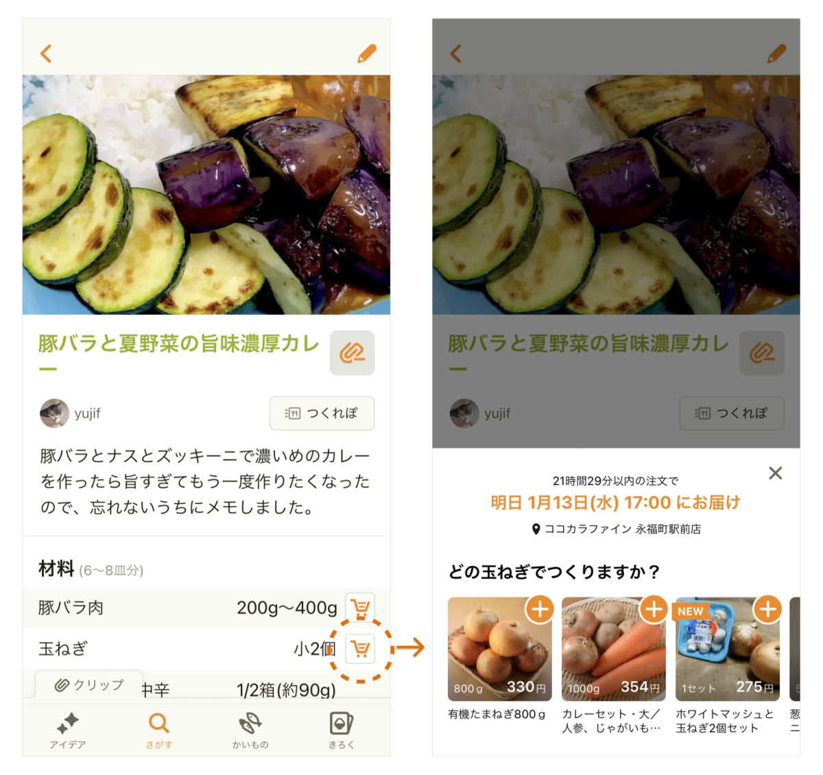
レシピサービスならではの良さとして、例えば「材料欄からスムーズに買える」という便利さがあります。作りたいレシピが見つかったとき、必要な食材をすぐに買い揃えられます*2

買い物からレシピへ

逆に、買い物からレシピへの流れもあります。

気になる食材の楽しみ方がすぐ見つかる

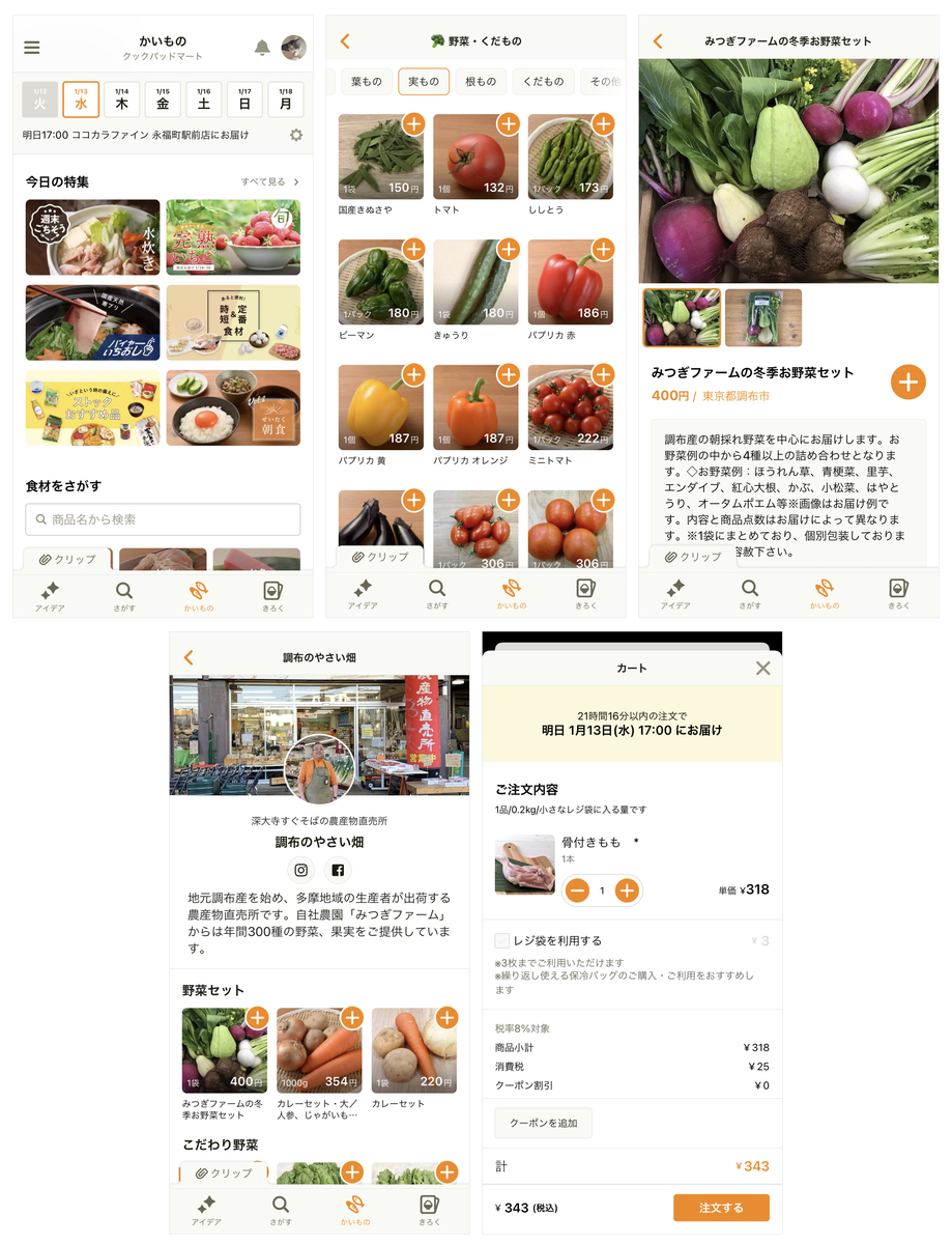
クックパッドマートの仕組みによって、精肉店や鮮魚店などの専門店や地域の農家など、さまざまなお店・生産者の魅力的な食材をアプリから一覧できます。

食材を眺めていて「へぇ〜こんなの買えるんだ!」「どう食べるのが良いのだろう?」と気になったら、すぐに自分好みの食べ方・楽しみ方を、クックパッドに集まる沢山のアイデアの中から見つけられます。

「明日はこれ作ろう!」「週末はこれが食べたいな〜」とワクワクしながら注文し、次の料理が楽しみになる、そんな素敵な時間を作れるかもしれません。

実は SwiftUI で作られている

買い物機能の画面は、そのほとんど全てが SwiftUI で実装されています。

SwiftUI は iOS / macOS アプリを構築できるフレームワーク*3です。2019年の WWDC で Apple から発表されました。従来の UIKit と比べて、より簡潔なコードで UI を組める点が特徴的です。

  • 利点
    • UI を作りやすく、生産性が向上する
    • 将来的に標準化しうる SwiftUI にキャッチアップできる
    • UIKit と組み合わせて使える
    • Dynamic Type、Dark Mode など iOS の最近の機能が考慮されている
  • 欠点
    • まだ挙動に不具合が残っている部分もある
    • iOS 12 以前では使えない
    • UIKit に比べると機能が足りていない
    • 知見を持つエンジニアがまだ限られている

SwiftUI はまだ比較的新しい技術であり、上記のようなメリットとデメリットが考えられます。ゼロから作る新規アプリではなく、長い歴史もあって大規模なクックパッドアプリ*4で、なぜ SwiftUI を本番投入することにしたのでしょうか?

技術選定の背景

1. 本番で早く検証し、サービス開発の効率を上げたい

「レシピ」と「買い物」を融合して、毎日の料理を楽しみにすること、それがこの買い物機能をつくる目的です。

最終的に目指す先は決まっていても、どういうコンセプトが最も良いのか、どのような機能・UI ならコンセプトを実現できるのか、具体的な形はまだ誰にも分かっていません。何度も作り変えながら模索していくことになります。

実生活の中で使って発見を増やす

新しいアイデアの検証では、最小限のプロトタイプを作り、ユーザーインタビューをして判断することが一般的です。時間を費やしすぎずに重要な知見を得られる点がメリットですが、それだけでは不十分な面もあると経験上感じています。

実際にアプリを使っていると、開発中やインタビュー中など当初は気づいていなかった価値や問題を実感して気持ちが変わることがあります。

実生活で試してこそ課題や価値が分かる

自宅のリビングやキッチン、通勤中、送り迎えや買い物など、現場にいる当事者だからこそ、課題に対する解像度も高く「どうなっていたら嬉しいのか?」という解決策が自然と浮かぶこともあり、結果的に質の高いフィードバックが得られやすいと思っています。

「レシピ」と「買い物」を組み合わせた価値を追求していくためには、瞬発的な検証だけでなく、日常的に使ってなるべく深い発見を重ねて、両者で補完しながらユーザー理解を精緻化していくことが一層重要ではないかと考えていました。

そのためには、実際のアプリを使って本番といえる環境で素早く検証を積み重ねられることが必要になります。

UI の「作って壊し」をやりやすく

では、どうすれば素早くアプリを本番で試せるのでしょうか。今回の場合、UI 実装を速くすることが効果的に思えました。

買い物機能は完全に新規のアプリケーションというわけでもないので、バックエンドはクックパッドマートの API を使えるなど、基礎部分がある程度固まっていました。そのため、レシピアプリ側でまず最低限使える状態にした後、改善を繰り返す期間が焦点となってきます。

そのタイミングで最も変動が大きいのは UI ではないかと思います。

使うデータは同じでも、目的に応じて見せ方は変わる

サーバーから返す情報が同じままでも、見せ方を変えるだけで印象や体験は変えられます。時には API からまるごと変える場合もありますが、多くは UI(View 層)の作り直しが楽になるだけでも実装は速くなります。

このように UI の「作って壊し」を頻繁に繰り返しやすい仕組みを用意したいと考える中で、SwiftUI が候補の一つとして挙がりました。

2. SwiftUI のリスクを抑えつつ導入できる見込みがあった

クックパッド iOS アプリでは 2メジャーバージョンをサポート

クックパッド iOS アプリの対応方針

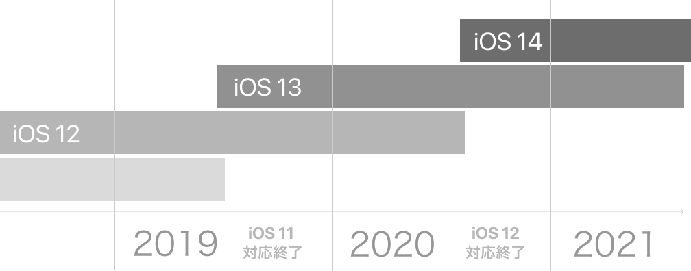
買い物機能のリリース時期は2020年後半を予定していました。例年通りなら iOS 14 がリリースされる頃です。クックパッド iOS アプリは最新2メジャーバージョンをサポートする方針で、iOS 13 と 14 に向けた体制となります。そのため、iOS 12 以下で SwiftUI を使えないことはそれほど大きな問題ではありませんでした。

機能・画面単位で切り分けやすいアーキテクチャ

クックパッド iOS アプリの1画面のアーキテクチャ(https://logmi.jp/tech/articles/321186

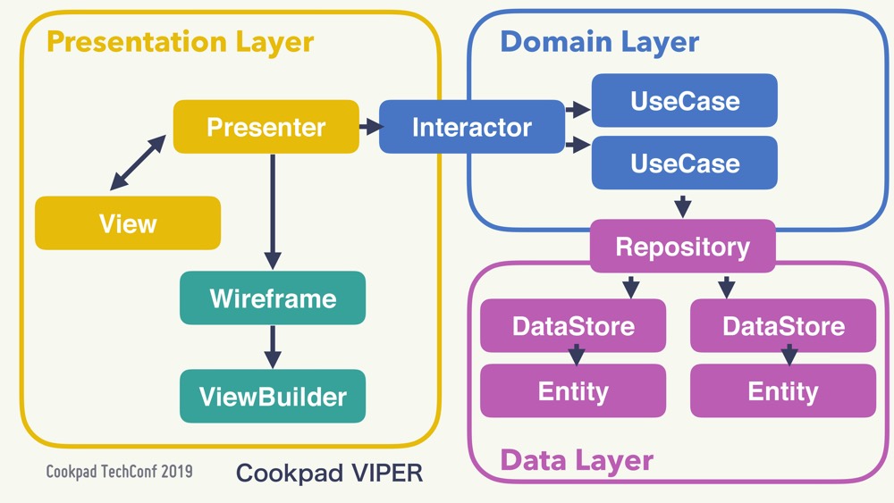
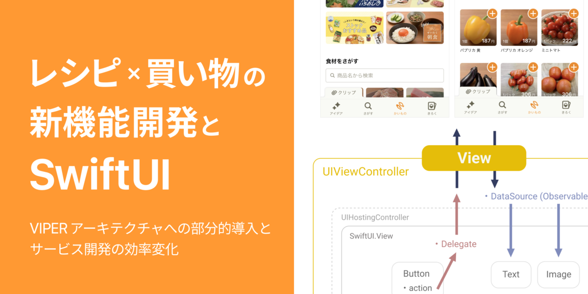
クックパッド iOS アプリでは数年前から VIPER ベースの Layered Architecture を採用しており、責務ごとにしっかりと実装が分かれていました。また、マルチモジュール化*5も進めており、大きな機能はモジュール単位で分離されているため、他の機能開発にも影響せず実装を進めやすいという点もありました。一部だけ SwiftUI を導入するのも容易な環境だったと言えます。

【方針】View 層のみで SwiftUI を部分的に導入する

これらの状況を総合して、メリットを生かしつつリスクを最低限に抑えられる形であれば、SwiftUI を導入するのは良い選択だと考えました。

具体的には、既存の VIPER アーキテクチャに適合したまま、View 層のみで SwiftUI を使うという形です。SwiftUI には画面遷移を行うための NavigationView などのコンポーネントもありますが、それらは使わずにあくまで素朴な UI コンポーネントのみを使います。

  • 使う例:Button, Text, VStack, HStack, ZStack, ScrollView
  • 使わない例:NavigationView, List, Form, TextField*6

画面単位で完全に切り分けられているため、もし SwiftUI で実装に困難が生じたらすぐにそこだけでも UIKit に戻せるというリスク対策になっています。

実装

既存のVIPER アーキテクチャへの SwiftUI の組み込み

SwiftUI を組み込んだVIPER View 層の概略図

基本的には、画面(VIPERシーン)ごとに従来通り UIViewController があり、そこに橋渡し役の UIHostingController を介して、SwiftUI で書かれた View が置かれる形です。

ここで、SwiftUI.View へデータを流し込むためには DataSource、SwiftUI.View からユーザー操作等のイベントを伝えるためには Delegate をそれぞれ用意して渡しています(詳しくは後述)。

final class KaimonoCartViewController: UIViewController,
    KaimonoCartViewProtocol, 
    KaimonoCartViewDelegate {

    ……

    private var dataSource: KaimonoCartView.DataSource = .init()

    override public func viewDidLoad() {
        super.viewDidLoad()

        let rootView = KaimonoCartView(delegate: self, dataSource: dataSource) 
        let hostingVC = UIHostingController(rootView: rootView)
        addChild(hostingVC)
        hostingVC.didMove(toParent: self)
        view.addSubview(hostingVC.view)
        hostingVC.view.translatesAutoresizingMaskIntoConstraints = false
        hostingVC.view.al.pinEdgesToSuperview() // 内製の Auto Layout helper 
        
        ……
    }
}

UIViewController から SwiftUI.View へデータを流し込む

VIPER アーキテクチャで Interactor → Presenter → ViewController と渡ってくるデータを、 SwiftUI で書かれた View 側に伝える際には ObservableObject を使っています。

https://developer.apple.com/documentation/swiftui/managing-model-data-in-your-app

本稿のコード例では DataSource と名付けています。View で必要なデータは @Published をつけたプロパティとして、DataSource に定義しておきます。

struct KaimonoCartView: View {
    class DataSource: ObservableObject, ReactiveCompatible {
        @Published var isOrderProcessing: Bool = false
        @Published var isCartProductsLoading: Bool = true
        @Published var cartProducts: [CartProduct] = []
        ……
    }
   
    weak var delegate: KaimonoCartViewDelegate?
    @ObservedObject var dataSource: DataSource
    ……

    var body: some View { 
       ……
    }
}

その上で、DataSource は親の ViewController で所有*7して、View からは @ObservedObject property wrapper でそれを監視させます。

クックパッド iOS アプリでは VIPER のデータフローに RxSwift を利用しているため、ReactiveCompatible プロトコルにも適合させて以下のように繋ぎました。

// KaimonoCartViewController.swift

    presenter.cartProducts
        .drive(dataSource.rx.cartProducts)
        .disposed(by: disposeBag)

    presenter.isCartProductsLoading
        .drive(dataSource.rx.isCartProductsLoading)
        .disposed(by: disposeBag)

    presenter.isOrderProcessing
        .drive(dataSource.rx.isOrderProcessing)
        .disposed(by: disposeBag)

このように ViewController の DataSource へ最新の値を流し込めば、あとは値の変化に応じて自動的に View が再描画されます。

SwiftUI.View から UIViewController へイベントを伝える

View で起きたイベントを ViewController に伝える際には Delegate を使いました。

基本的には UIKit などの命名規則と合わせて、Delegate の呼び出し元の名前に動詞を続ける命名にしています。ただし、第一引数で self を渡すのはやめています*8

// KaimonoCartView.swift

protocol KaimonoCartViewDelegate: AnyObject {
    func kaimonoCartViewDidTapProductTile(productID: Product.ID)
    func kaimonoCartViewDidTapTermsLawButton()
    func kaimonoCartViewDidTapOrderButton()
    ……
}
// KaimonoCartView.swift

    private var footer: some View { 
        HStack(alignment: .center, spacing: 0) {
            ……
            Button(action: {
                delegate?.kaimonoCartViewDidTapOrderButton()
            }, label: {
                Text("注文する")
                ……
            })
        }
    }
// KaimonoCartViewController.swift

    func kaimonoCartViewDidTapOrderButton(){
        // 注文処理のトリガーに必要な値を流す
    }

SwiftUI で実際どうだったか

よかった点:開発効率の向上

まず、UI の組み立ては期待通り快適で素早くできました。その様子は Apple 公式のチュートリアルでもおわかりいただけると思うので割愛します。ここでは実際に UI を作り込んでいく中で良かったと感じた点をご紹介します。

1. 複雑・多様な状態のある画面実装が楽

買い物機能では、サービスの特性上さまざまな要因で表示内容を変える必要があります。 (例:受け取り場所の設定状況、注文締切、受け取りのタイミングなど)

かいものタブ トップ画面のパターン例(まだまだ沢山ある)

従来なら UITableView や UICollectionView を使った実装を考えるところですが、セルやレイアウトの定義、更新タイミングなど考慮すべきこともコード量も多くなります。複雑度が増すほど不具合も生んでしまいやすく、この状況では画面構成を色々と変えてみたくても実装者のフットワークは重くなります。

これに対して、SwiftUI では表示条件をそのままシンプルに書けば良く、データが更新された時の再描画も任せておけます。
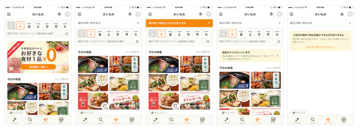
具体例1:かいものタブ トップ画面

例えば以下の要件があるとします。

  • 過去に1件以上注文があるなら「最近の買い物を見る」導線を表示したい
    • 配送済み かつ 未受け取りの品があるなら それを「受け取り可能なご注文があります」に変えたい
  • 過去に1件以上注文があるが 配送時のプッシュ通知がオフ なら、通知設定導線を表示したい

View は次のように表現できます。

// KaimonoTopView.swift

    var body: some View {
        ScrollView {
            VStack(alignment: .leading, spacing: 16) {
                if dataSource.isLoadingDeliveries {
                    ActivityIndicator()
                } else {
                    if dataSource.hasLeastOneOrder {
                        if dataSource.hasAcceptableDeliveries {
                            acceptableDeliveriesRow // 「受け取り可能なご注文があります」
                        } else {
                            normalDeliveriesRow // 「最近の買い物を見る」
                        }

                        if dataSource.isPushNotificationDenied {
                            pushNotificationDeniedRow // 通知設定導線
                        }
                    }
                }
                ……
            }
        }
    }

実際にはこれ以外にも様々な要件があり、かなり複雑な画面です。しかし、SwiftUI なら素朴に条件を並べるだけで構成できます。コードを見て仕様把握しやすく、改変したいときも素直に変えるだけで済むので保守性が高いと感じました。

具体例2:カート画面

SwiftUI の宣言的な表現の良さは、以下の場面でも実感できました。

  • 注文ボタンが押されたら、注文処理が完了するまではボタンを無効化しておきたい
    • 変更操作や画面遷移をしないように「品数の変更」や「よくある質問」などのボタンも一通り無効化しておきたい
  • もし注文処理が通信エラー等で中断されたら、再度押せるように有効化したい

この要件を .disabled(_:) modifier 1行で対応できるのはとても心地よいと感じます。

https://developer.apple.com/documentation/swiftui/list/disabled(_:)

// KaimonoCartView.swift
// 注文処理中だけ、ボタンを無効化したい

    var body: some View {
        ZStack {
            VStack(spacing: 0) {
                if dataSource.isCartLoading {
                    ActivityIndicator()
                } else {
                    ScrollView {
                        paymentSettingRow
                        deliveryInformationRow
                        deliveryTutorialsRow
                        notesRow
                        faqRow
                    }
                    Divider()
                    footer
                }
            }
            .disabled(dataSource.isOrderProcessing)
            // ↑この1行で、この VStack 内の Button などはすべて良い感じに disabled になる
           
            if dataSource.isOrderProcessing {
                ActivityIndicatorToast()
            }
        }
    }

2. UI コンポーネントの取り回しが楽

同じ「商品タイル」を使う画面例

1つの UI コンポーネントを複数画面で使い回すことはよくあると思います。 UIKit でも使い回し自体は可能でしたが、SwiftUI ではより扱いやすいと感じました。

2.1 柔軟に移植や組み合わせができる

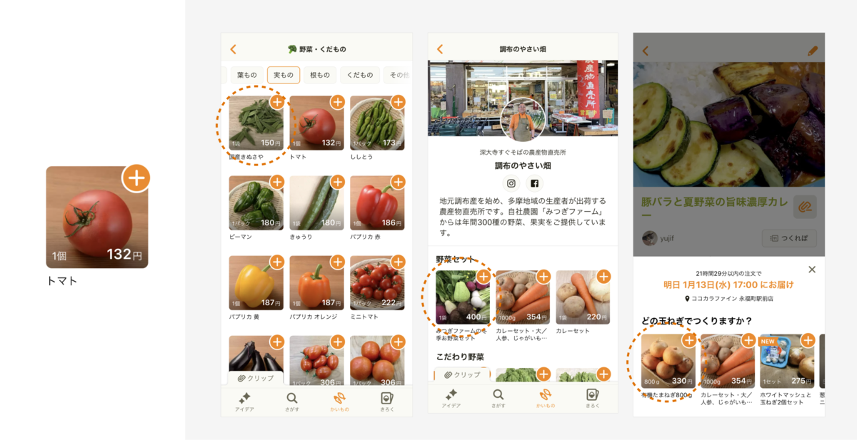
例えば買い物機能では、商品タイル ProductTile という UI コンポーネントを多用しています。

struct ProductTile: View {
    var product: Product
    var didTapImage: (_ productID: Int64) -> Void
    var didTapAddToCartButton: (_ productID: Int64) -> Void

    var body: some View {
       ……
    }
}

商品タイルのパターン例

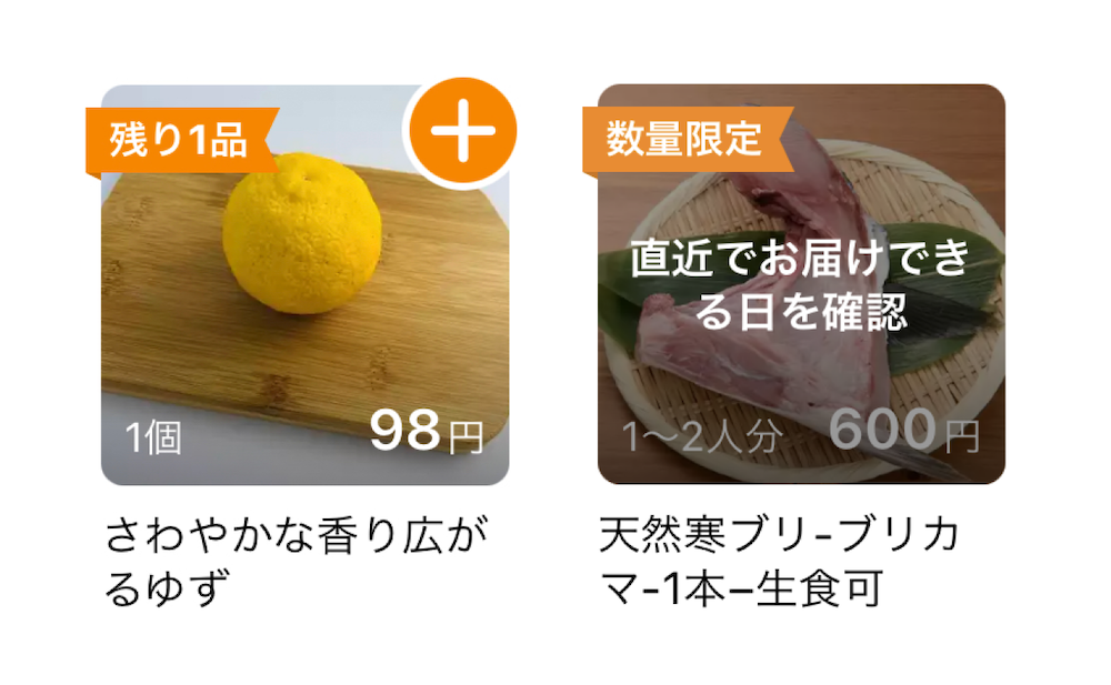
商品の状態によって「NEW」「数量限定」などのラベルが表示されます。もし選択中の受け取り日にこの商品の配送がなければ「直近でお届けできる日を確認」、在庫がなければ「売り切れ」などのオーバーレイも表示されます。

この ProductTile を機能させるには、少なくとも以下の3つを与える必要があります。

  • 商品データ product
  • 商品サムネイル画像をタップされたときの挙動 didTapImage
  • カート追加ボタンをタップされたときの挙動 didTapAddToCartButton

これは親 View から渡します。

UI コンポーネントの依存の概略図(例:店舗詳細画面)

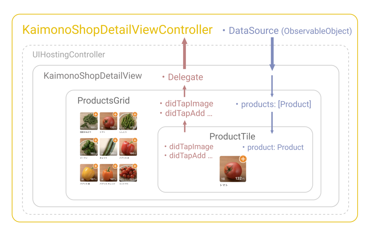
上図は、商品グリッド表示の ProductsGrid を埋め込んだ店舗詳細画面 KaimonoShopDetailView の例です。ProductsGrid を通して ProductTile はグリッド状に表示されます。

struct ProductsGrid: View {
    var products: [Product]
    var didTapImage: (_ productID: Int64) -> Void
    var didTapAddToCartButton: (_ productID: Int64) -> Void

    ………

    var body: some View {
        ForEach(0 ..< rows.count, id: \.self) { index in
            HStack(alignment: .top, spacing: gridSpacing) {
                ForEach(rows[index]) { product in
                    // ProductTile に必要なものは initializer の引数に示されている。
                    // 使う側はそれを用意して渡せば完了。
                    ProductTile(
                        product: product,
                        didTapImage: didTapImage,
                        didTapAddToCartButton: didTapAddToCartButton
                    )
                }
            }
        }
    }
}

前述の説明とも関連しますが、買い物機能の SwiftUI 実装では 親 View から 子 View へ必要なデータを与えて、子 View で起きたイベントの処理は親に委譲される構造にしました。

つまり、依存は親から注入されるので UI コンポーネント自体はどれも無垢です。その画面特有の都合などは最終的に委譲された先にたどり着く ViewController の実装が担います。そのため、UI コンポーネント自体はどの画面にもほぼコピー&ペーストですぐ移植できますし、互いに組み合わせたり入れ込むこともたやすくできます。

異なる UI コンポーネントに置き換えたいときも、同じものに依存しているなら変更箇所はごくわずかで済みます。

UIKit でも扱いやすい UI コンポーネントを作ることは可能でしたが、SwiftUI.View の struct ならより手軽に用意できる印象があります。

2.2 後から細分化もしやすい

必要なタイミングで「改変して独立」しやすくなっているとも感じました。

UI コンポーネントは細かすぎても荒すぎても不便ですし、開発状況の変化によって望ましい形は変わっていきます。最初は複数画面で同一でも良かった UI コンポーネントも、別々の道を歩みはじめたくなるケースはよくあります。

そのように分離して独立させたいとき、UIKit では Interface Builder (.xib, .storyboard) を使う場合でもすべてコードで書く場合でも Auto Layout の制約*9などに気を配る必要がありました。また、もし古い IBOutlet の紐付きを見落とせば、アプリのクラッシュの原因*10にもなってしまいます。

SwiftUI では前述の依存の構造とも相まってそのようなしがらみがなく、一部だけ抽出して独立させるのもかなり簡単だと思えました。

最初から粒度を気にせずに UI を作り始められて、後で必要になったときに結合・分離に柔軟に対応できるのは魅力的です。

3. スタイル調整も楽

スタイルを調整しやすいのも良い点です。よく使うシャドウや角丸に加えて、マージン調整、文字の装飾なども UIKit に比べて簡潔で扱いやすくなっています。細部までこだわった表現も簡単にできて、デザイナーと一緒にベストな実装を模索できました。

デザイナーも Pull Request を

デザイナー自身で細部を調整した Pull Request

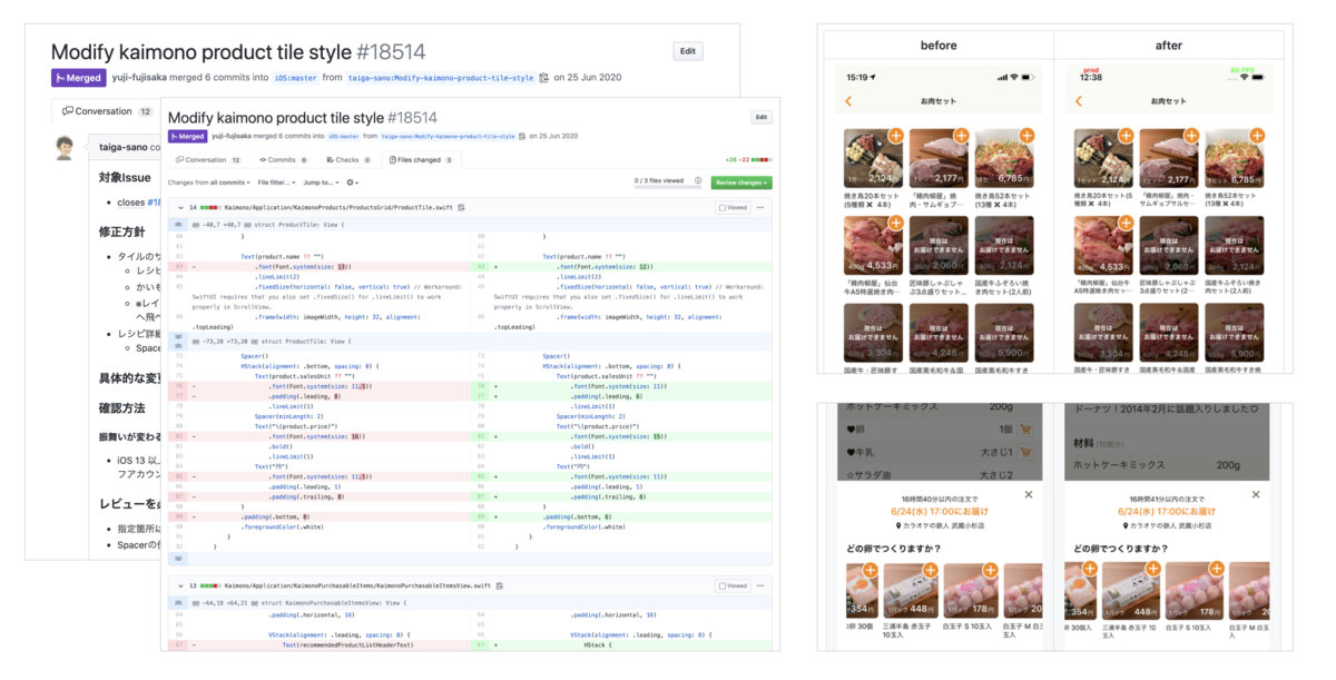
同じチームのデザイナー @sn_taiga さんが自らスタイル調整の Pull Request を出してくれることが何度かありました。

UI を微調整したいとき、エンジニアとデザイナーの間で指示・実装・修正確認のやりとりが何度も発生することもあると思います。もしデザイナーが直接修正できるなら、オーバーヘッドを減らして時間を短縮できます。

従来の UIKit に比べて分かりやすく、iOS エンジニアでなくても簡単に修正できる部分が増えていくのは大きな進歩だと感じます。

困った点:余計な苦労もある

メリットもありましたが、予想通り SwiftUI を使うことで苦労した点もあります。

1. 不具合

iOS 13.0〜13.4 あたりでは「それはないでしょ……」という不具合もありました。一つ一つ対応策はあって地道に対処していくことになるのですが、それだけでもう一記事かけそうなので、ここでは一例だけ紹介します。

例:ScrollView 内の Button が、スクロールのためのタップで誤動作してしまう

iOS 13 の初期の頃に実機で起きる不具合で、動作確認中にショックを受けました。これは少なくとも iOS 13.5.1 以降*11では修正済みのようです。買い物機能ではワークアラウンドとして .onTapGesture を代わりに使っており、時期を見て Button に戻していく予定です。iOS バージョンによって分岐する Button 用コンポーネントを用意する案も検討しています。

    ScrollView {
        VStack(alignment: .leading) {
            ……
            CartSectionHeader(title: "受け取り情報")
            PickupNameRow(pickupName: dataSource.pickupName)
                .onTapGesture(perform: didTapPickupNameRow)
                // Button はスクロール時のタップで誤動作することがあるので、代わりに .onTapGesture を使う
            Divider()            
            ……
        }
    }

2. 機能不足

iOS 14 からは必要なものが大分揃った印象がありますが、iOS 13 の SwiftUI では「あってほしい……」と思う機能が足りません。想定していた通り UIKit で代用するか、工夫したコンポーネントを用意するなどの対応が必要になります。

例1:ScrollView の contentOffset の get / set

ボタンをタップしたら指定位置まで自動でスクロールしたい、といった要件はよくあります。しかし、iOS 13 の SwiftUI の ScrollView ではスクロール位置の設定が UIKit のように簡単にはできません。iOS 14 からは ScrollViewReaderScrollViewProxy が登場してできるようになりました。

https://developer.apple.com/documentation/swiftui/scrollviewproxy

例2:読みやすい幅対応

クックパッド iOS アプリは iPad にも対応しており、読みやすい幅を考慮した UI にしています。

techlife.cookpad.com

Auto Layout では readableContentGuide のような仕組みが用意されていましたが、iOS 13 の SwiftUI では公式に用意された仕組みを見つけることができませんでした。

そのため GeometryReader と 与えられた画面幅に対して読みやすい幅を返す ApproximateReadableContent というヘルパー(社内製)を組み合わせた ReadableScrollView を用意して対応しました。

struct ReadableScrollView<Content: View>: View {
    var content: Content

    var body: some View {
        ScrollView {
             HStack(alignment: .top, spacing: 0) {
                  Spacer(minLength: 0)
                  VStack(alignment: .leading, spacing: 0) {
                      content
                  }
                  .frame(maxWidth: ApproximateReadableContent.maximumWidth)                  
                  Spacer(minLength: 0)                  
            }
        }
    }
}

他には

@Environment(\.horizontalSizeClass) var sizeClass

をもとに適切な padding を設定するという方法もあるようです。

例3:遅延読み込み

VStack 内に並べる項目数が非常に多くなると、画面描画がカクカクしはじめるなどパフォーマンス上の問題が出てきます。

見えない部分まですべて描画するのではなく、スクロールに合わせて逐次構築していく「遅延読み込み」を実現したいところですが、iOS 13 の SwiftUI ではまだ便利な仕組みが用意されていません。項目数や構成を減らして軽くするか、従来の UICollectionView などに置き換えるかといった選択肢になります。

iOS 14 からは LazyVStack / LazyHStack のように欲しかったものが揃ってきました。詳しくは WWDC 2020 の Stacks, Grids, and Outlines in SwiftUI をご参照ください。

developer.apple.com

まとめ

SwiftUI の導入によって、総合的には開発体験と効率は向上できたと思っています。一度慣れれば新規の UI 実装も素早くでき、改変も楽にできます。何より楽しく開発できるという点で、SwiftUI を採用して良かったと感じます。

iOS 13 の初期バージョンの SwiftUI にはまだ困る面もあります。ただそれは今後最新の iOS が普及するにつれて解決する問題だと思っています。現状では QA 体制・自動テストの工夫で問題に気づけるようにし、事業的な優先度と実装の難易度を把握して、適宜 UIKit を使うなどの判断ができる体制で付き合っていく必要はあります。

チームで「改善していける」良い雰囲気づくり

開発体験の向上については、アプリ実装の素早さがチームの雰囲気づくりにも貢献できた点があると感じています。

デザイナーと話しながら、色々なパターンを素早く実際に作って、本番データでアプリの挙動をすぐに試してみることも可能でした。ミーティングで出たアイデアをすぐに具体化してみて、UI 面の課題やコンテンツ面・運用上の問題に気づいて軌道修正する、そのように勢いよく改善が進んでいくと、開発のモチベーションも上がると思っています。

開発チームの Slack の盛り上がりの様子

このように楽しく素早い開発ができる環境を整え、チームで次々と改善していける良い雰囲気づくりができた点でも一定の成果はあったと感じています。

一方で、現時点のユーザー体験はまだまだ理想形にはほど遠い状態です。 2021年はこの作り変えやすい土台を活かして、「レシピ」と「買い物」が融合した圧倒的に良い体験を探っていきたいと考えています。

クックパッドでは仲間を募集しています!

今回は買い物機能の開発にあたっての技術選定や SwiftUI の活用事例についてご紹介しました。

買い物機能の取り組みにご興味を持ってくださった方は、プロダクトマネージャー @naganyo さんの1年の振り返りの記事もぜひご一読ください。 note.com

クックパッドでは技術を活用してサービスや事業を推進していきたい方を大募集中です!

iOS・Android・Web フロントエンド、サーバーサイド(Ruby on Rails, Java 等)、検索技術、ログ分析、マーケティングなどなど様々な領域で取り組みたい課題が沢山あります。 カジュアル面談や学生インターンシップなども随時実施していますので、ぜひお気軽にご連絡ください!

cookpad.careers

*1:近隣地域の生産者や市場直送の新鮮でおいしい食材を、1品から送料無料で購入できる。https://info.cookpad.com/pr/news/press_2020_1015

*2:最短で注文当日に受け取り可能。https://www.youtube.com/watch?v=FIhAFjVmS10

*3:より正確には「Apple プラットフォーム向けのアプリ」で、iOS や macOS に限らず tvOS や watchOS のアプリも作れる。https://developer.apple.com/xcode/swiftui/

*4:最初のコミットは2012年の8月、2020年12月末時点では6万1,000以上のコミットを経て、24万1,800行のコードベースがある。

*5:クックパッドのエンジニアが語る、巨大で歴史あるアプリにおける破壊と創造 - ログミーTech https://logmi.jp/tech/articles/321186

*6:検証当時、NavigationView は動作が不安定な部分があったため。List, Form はカスタマイズ性に乏しく、TextField も日本語変換時の動作が怪しかったため。

*7:@ObservedObject は iOS 13.3 未満あたりで値を弱参照していて、ふとした拍子に消える可能性があったので ViewController 側に持たせるようにしている。

*8:UIKit では UI 操作などのために外部に提供するインターフェイスとなるが、SwiftUI では ObservableObject のように別の形が提供されているので基本的には不要なはず。むしろ SwiftUI のスコープ外から意図しない操作を可能にしてクラッシュさせる恐れもある。ここではそれを回避したいため。

*9:既存実装では Auto Layout の制約がからまっていて読み解きが大変だったり、結局一度消してすべて付け直したりすることもよくある。UIStackView によって改善されたものの、後から一部を抜き出すときはやや煩雑な印象がある。

*10:コードと xib の両方から消したつもりで、xib 側に一部残っていると実行時エラーでクラッシュする。

*11:いつの間にか直っていた。実機のみで起きる不具合で、アップデート後は iOS 13.0 〜13.4 の実機が手に入りづらく、修正された正確なバージョンはわからない。

Generating custom SF Symbols from existing SVG files

(日本語版はこちらへ)

Hello and Happy New Year! I'm Vincent (@vincentisambart) from the Mobile Infrastructure team here at Cookpad Japan.

Recently, Apple has been putting a lot of energy into SF Symbols, symbols to use on your app's screens. SF Symbols allows you to not only use symbols created by Apple, but also custom ones you made yourself. To create custom symbols, following the official workflow seemed quite time-consuming, so I tried to automatically generate custom symbols from existing SVG files instead.

How it started

For symbols, single color icons, the iOS Cookpad Japan app has been using CookpadSymbols, a font made only of symbols, for quite a while. However, a few months ago, our designers asked if we could switch from using a font to using SVG files.

The icons used in the font were already made from SVGs, but designers wanted to simplify the process, and not have to load the vector files into some online tool to generate a new version of the font every time a change was made. And these days SVG files can be used directly in a lot of places so that should be doable.

You can see how a few CookpadSymbols symbols look like below.

f:id:vincentisambart:20201228112920p:plain

On iOS there are 3 different ways to use SVGs as symbols.

  1. Use them as pixel images of a specific size (as if they had been converted to PNG)
  2. Use them as vector data ("Preserve Vector Data" setting in asset catalogs)
    • Starting from Xcode 12 you can use SVG files directly, but to use them as vector data on iOS 12 and below, it seems that you have to first convert them to PDF.
  3. Use them as custom symbols (custom SF Symbols)
    • Requires iOS 13 and above.

The iOS Cookpad Japan app had been using symbols from a font, changing their displayed size depending on the screen, so using fixed size images would be pretty inconvenient. The source is a vector image so you can easily generate a lot of differently sized images, but still.

Apple has recently been pushing SF Symbols, and at the time our designers asked for switching from a symbol font, we were already talking about stopping support for iOS 12 very shortly after. So I decided to go for choice 3. If we ended up delaying stopping support for iOS 12 for a long period of time, or if implementation of that choice ended up being too complicated, I could always fall back to choice 2.

In the end, stopping support of iOS 12 was delayed a bit, but I still went to choice 3. Before explaining how the implementation went, we should probably have a better look at custom symbols.

Custom Symbols

To introduce custom symbols, we first have to talk about SF Symbols. SF Symbols is a feature available starting from iOS 13, providing symbols (one color icons that can be used at any size) that developers can use in their apps. In contrast with normal fixed size images, they are made to be used in conjunction with text: their size is specified with a font size, and their baseline can be properly aligned with text.

You can see a list and search through SF Symbols inside the SF Symbols app provided by Apple as you can see in the screenshot below.

f:id:vincentisambart:20201228112934p:plain

You are not limited to the symbols provided by Apple, you can also use your own custom symbols. To make you own custom symbols, if you follow the official guide, you first have to choose in the SF Symbols app an existing symbol close to the one you want to make, and export it as SVG. You then edit it in a vector graphics editor (like Illustrator) to get a symbol usable in Xcode.

The existing symbol font CookpadSymbols had close to 300 symbols. Editing them one by one would take a lot of effort. We are trying to make life easier for designers, so giving them more work would not make much sense. Automation is a bit part of the job of developers, and after all SVG is XML, making it pretty malleable, so I started working on it.

Trying to load an existing SVG into Xcode

The SVG files were already prepared by designers (by the way those SVGs are also used on the Web and Android). You can see one of those SVGs below (no need to try to understand the content in detail).

<svg height="64" width="64" xmlns="http://www.w3.org/2000/svg" viewBox="0 0 64 64"><circle cx="32" cy="12" r="8"/><path d="M52.7 50.941l-7.913-4.396-3.335-8.34-.642-8.994 3.257.723 1.517 6.826a3.504 3.504 0 004.176 2.658 3.5 3.5 0 002.658-4.176l-2-9a3.5 3.5 0 00-2.658-2.658l-9-2a3.416 3.416 0 00-1.276-.037c-.16-.022-.319-.047-.484-.047h-8c-.163 0-.32.031-.479.055a3.48 3.48 0 00-3.254 1.26l-7.163 8.953-4.679.781a3.501 3.501 0 001.15 6.904l6-1a3.513 3.513 0 002.158-1.266l4.18-5.225 1.346 6.279-6.126 8.752A3.503 3.503 0 0021.5 49v9a3.5 3.5 0 107 0v-7.896l5.322-7.604h1.808l3.12 7.801a3.51 3.51 0 001.55 1.76l9 5a3.5 3.5 0 004.759-1.36 3.5 3.5 0 00-1.359-4.76z"/></svg>

If you try loading it in a web browser or vector graphics editor, you get this.

f:id:vincentisambart:20201228112940p:plain

Xcode 12 can read SVGs, so without thinking too much, if you try to drag & drop the same file in an asset catalog, you get the following.

f:id:vincentisambart:20201228113043p:plain

Pretty different to the expected result... Looking at the content of the SVG, the file content seemed optimized (not containing any non-required information), so I thought the file not appearing correctly might be due to Xcode not handling that type of optimized SVG properly. Looking more closely at the content, even though it seems optimized, in path, having some numbers starting with 0s looked unnatural to me (for example 004.176). It is just a text (XML) file, so after having a quick look at the SVG specs, I loaded the SVG in a text editor, and tried adding spaces after each of those unnatural 0s (for example 004.1760 0 4.176). Loading the modified file into Xcode gave the following.

f:id:vincentisambart:20201228113052p:plain

Not perfect yet, but still better than we had before. So it seems that Xcode's SVG parsing is indeed a bit limited.

Compensating for Xcode's poor understanding of the SVG format would require spending time to learn and understand the SVG specs, so before even thinking of trying that, first isn't there a tool that would do it for us?

Looking at the repository for the SVGs that the designers had created, it seemed they were using a tool called SVGO for optimizing the SVGs. Looking at that tool's settings, there was a path-related setting that looked related. After adding the 2 lines below to the already existing svgo.yml setting file, and then running SVGO, all updated SVGs could now be properly loaded into Xcode.

  - convertPathData:
      # Xcode doesn't handle properly paths without spaces after flags
      noSpaceAfterFlags: false

f:id:vincentisambart:20201228113102p:plain

SVG being loaded properly with only setting change was a relief.

With the new settings, the SVG files became a tiny bit bigger due to the added spaces, but using different settings depending on the platform would be cumbersome, so we chose to use these settings for all platforms.

Being able to read these SVGs into Xcode was an important first step, but we want to handle them not as normal images but as symbols, so we now have to prepare symbols from these SVGs.

Providing symbols

Following the official guide, providing symbols first requires to export an existing symbol from the SF Symbols app. If you export what seems to be one of the simplest symbols circle, you get an SVG that looks like the following.

f:id:vincentisambart:20201228113116p:plain

For one symbol you can provide 3 sizes and 8 weights, and providing all of them would probably be the best, but reading the official guide, only Regular Medium (Regular-M) is required. I chose to only provide the required shape at first. If providing other sizes just requires some simple scaling, generating other sizes afterwards should be pretty easy.

The goal was to make managing symbols easy, so I decided to insert the SVGs' content into a template exported from the SF Symbols app, not by hand as the guide said, but automatically with a script. I wrote that script in Ruby as that was the easiest for me, but you should be able to do it pretty easily in any language with a good XML handling library. I tried making the code below simple and added many comments, so you should be able to follow along without knowing much Ruby. In the code I'm using CSS selectors as much as possible (#abcd points to nodes in the XML for which id is abcd).

We first start with a simple setup. Load the library we are going to use, define constants, and load the template.

require "nokogiri" # Load the XML library we are going to use.

# Path to file exported from the SF Symbols app
TEMPLATE_PATH = "path/to/circle.svg"
# Path to one of the SVGs provided by the designers
SOURCE_SVG_PATH = "icon.svg"
# Path to the SVG we are generating
DESTINATION_SVG_PATH = "icon-symbol.svg"

# Expected icon size
ICON_WIDTH = 64
ICON_HEIGHT = 64
# Additional scaling to have a size closer to Apple's provided SF Symbols
# (I just tried different values and that looked pretty close)
ADDITIONAL_SCALING = 1.7
# Width of #left-margin and #right-margin inside the SVG
MARGIN_LINE_WIDTH = 0.5
# Additional white space added on each side
ADDITIONAL_HORIZONTAL_MARGIN = 4

# Load the template.
template_svg = File.open(TEMPLATE_PATH) do |f|
  # To generate a better looking SVG, ignore whitespaces.
  Nokogiri::XML(f) { |config| config.noblanks }
end

The template is an XML (SVG) split into 3 groups (#Notes, #Guides, #Symbols).

<?xml version="1.0" encoding="UTF-8"?>
<!--Generator: Apple Native CoreSVG 149-->
<!DOCTYPE svg
PUBLIC "-//W3C//DTD SVG 1.1//EN"
       "http://www.w3.org/Graphics/SVG/1.1/DTD/svg11.dtd">
<svg version="1.1" xmlns="http://www.w3.org/2000/svg" xmlns:xlink="http://www.w3.org/1999/xlink" width="3300" height="2200">
 <!--glyph: "uni100000.medium", point size: 100.000000, font version: "Version 16.0d18e1", template writer version: "8"-->
 <g id="Notes">
  (...)
 </g>
 <g id="Guides">
  (...)
 </g>
 <g id="Symbols">
  (...)
 </g>
</svg>

The symbols are included into the #Symbols as you can see below.

 <g id="Symbols">
  <g id="Black-L" transform="matrix(1 0 0 1 2854.05 1556)">
   <path d="(...)"/>
  </g>
  <g id="Heavy-L" transform="matrix(1 0 0 1 2558.39 1556)">
   <path d="(...)"/>
  </g>
  <g id="Bold-L" transform="matrix(1 0 0 1 2262.88 1556)">

We will not provide symbols other than #Regular-M so we have to remove the other ones.

TEMPLATE_ICON_SIZES = ["S", "M", "L"]
TEMPLATE_ICON_WEIGHTS = ["Black", "Heavy", "Bold", "Semibold", "Medium", "Regular", "Light", "Thin", "Ultralight"]

# We are only providing "Regular-M", so remove the other shapes.
TEMPLATE_ICON_SIZES.each do |size|
  TEMPLATE_ICON_WEIGHTS.each do |weight|
    id = "#{weight}-#{size}"
    next if id == "Regular-M" # Only leave the mandatory shape.
    template_svg.at_css("##{id}").remove
  end
end

The #Notes group is mostly text to see in a vector graphics editor.

 <g id="Notes">
  <rect height="2200" id="artboard" style="fill:white;opacity:1" width="3300" x="0" y="0"/>
  <line id="" style="fill:none;stroke:black;opacity:1;stroke-width:0.5;" x1="263" x2="3036" y1="292" y2="292"/>
  <text style="stroke:none;fill:black;font-family:-apple-system,&quot;SF Pro Display&quot;,&quot;SF Pro Text&quot;,Helvetica,sans-serif;font-weight:bold;" transform="matrix(1 0 0 1 263 322)">Weight/Scale Variations</text>
  <text style="stroke:none;fill:black;font-family:-apple-system,&quot;SF Pro Display&quot;,&quot;SF Pro Text&quot;,Helvetica,sans-serif;text-anchor:middle;" transform="matrix(1 0 0 1 559.711 322)">Ultralight</text>
  (...)
  <text id="template-version" style="stroke:none;fill:black;font-family:-apple-system,&quot;SF Pro Display&quot;,&quot;SF Pro Text&quot;,Helvetica,sans-serif;text-anchor:end;" transform="matrix(1 0 0 1 3036 1933)">Template v.2.0</text>
  (...)
 </g>

From its name, it looks like #Notes could be removed without any problem, but in fact if you read the official documentation properly, it tells you that the #template-version text node inside #Notes is important. If you remove it, the position of left and right margins and the horizontal position of the shape inside those margins will be ignored. It is also recommended to not remove #artboard. If you really want to remove all unneeded nodes, removing child nodes of #Notes that have no id or an empty one might be OK.

Below the #Notes group, there is a very important #Guides group.

 <g id="Guides">
  (...)
  <line id="Baseline-S" style="fill:none;stroke:#27AAE1;opacity:1;stroke-width:0.5;" x1="263" x2="3036" y1="696" y2="696"/>
  <line id="Capline-S" style="fill:none;stroke:#27AAE1;opacity:1;stroke-width:0.5;" x1="263" x2="3036" y1="625.541" y2="625.541"/>
  (...)
  <line id="Baseline-M" style="fill:none;stroke:#27AAE1;opacity:1;stroke-width:0.5;" x1="263" x2="3036" y1="1126" y2="1126"/>
  <line id="Capline-M" style="fill:none;stroke:#27AAE1;opacity:1;stroke-width:0.5;" x1="263" x2="3036" y1="1055.54" y2="1055.54"/>
  (...)
  <line id="left-margin" style="fill:none;stroke:#00AEEF;stroke-width:0.5;opacity:1.0;" x1="1391.3" x2="1391.3" y1="1030.79" y2="1150.12"/>
  <line id="right-margin" style="fill:none;stroke:#00AEEF;stroke-width:0.5;opacity:1.0;" x1="1508.39" x2="1508.39" y1="1030.79" y2="1150.12"/>
 </g>

We are only providing a Regular-M symbol, so its vertical position between #Baseline-M and #Capline-M, and its horizontal position between #left-margin and #right-margin, are important. So we want to get the position of each of those guides.

By the way, as symbols have been designed to be used in conjunction with text, capline and baseline are typography terms. That is why if you look at the image of the template I included above, on the left side you have an A to be used as a reference.

def get_guide_value(template_svg, axis, xml_id)
  guide_node = template_svg.at_css("##{xml_id}")
  raise "invalid axis" unless %i{x y}.include?(axis)
  val1 = guide_node["#{axis}1"]
  val2 = guide_node["#{axis}2"]
  if val1 == nil || val1 != val2
    raise "invalid #{xml_id} guide"
  end
  val1.to_f # Convert the value from string to float.
end

# Get the x1 (should be the same as x2) of the #left-margin node.
original_left_margin = get_guide_value(template_svg, :x, "left-margin")
# Get the x1 (should be the same as x2) of the #right-margin node.
original_right_margin = get_guide_value(template_svg, :x, "right-margin")
# Get the y1 (should be the same as y2) of the #Baseline-M node.
baseline_y = get_guide_value(template_svg, :y, "Baseline-M")
# Get the y1 (should be the same as y2) of the #Capline-M node.
capline_y = get_guide_value(template_svg, :y, "Capline-M")

We then load the SVG icon and check if it has the expected size.

# Load the SVG icon.
icon_svg = File.open(SOURCE_SVG_PATH) do |f|
    # To generate a better looking SVG, ignore whitespaces.
  Nokogiri::XML(f) { |config| config.noblanks }
end

# The SVGs provided by designers had a fixed size of 64x64, so all the calculations below are based on this.
# If we get an unexpected size, the program ends in error.
# The SVG specs allows to specify width and height in not only numbers, but also percents, so handling a wider range of SVG files would be more complicated.
if icon_svg.root["width"] != ICON_WIDTH.to_s ||
  icon_svg.root["height"] != ICON_HEIGHT.to_s ||
  icon_svg.root["viewBox"] != "0 0 #{ICON_WIDTH} #{ICON_HEIGHT}"
  raise "expected icon size of #{icon.source_svg_path} to be (#{ICON_WIDTH}, #{ICON_HEIGHT})"
end

We then have to scale the provided icon to match the template.

The position of the left and right margins depend on the symbol chosen in the SF Symbols app, but #Baseline-M and #Capline-M are always at the same position, so we scale based on the spacing between those 2 guides.

scale = ((baseline_y - capline_y).abs / ICON_HEIGHT) * ADDITIONAL_SCALING
horizontal_center = (original_left_margin + original_right_margin) / 2

scaled_width = ICON_WIDTH * scale
scaled_height = ICON_HEIGHT * scale

# If you use the template's margins as-is, the generated symbol's width will depend on the template chosen.
# To not have to care about the template, we move the margin based on the computed symbol size.
horizontal_margin_to_center = scaled_width / 2 + MARGIN_LINE_WIDTH + ADDITIONAL_HORIZONTAL_MARGIN
adjusted_left_margin = horizontal_center - horizontal_margin_to_center
adjusted_right_margin = horizontal_center + horizontal_margin_to_center
left_margin_node = template_svg.at_css("#left-margin")
left_margin_node["x1"] = adjusted_left_margin.to_s
left_margin_node["x2"] = adjusted_left_margin.to_s
right_margin_node = template_svg.at_css("#right-margin")
right_margin_node["x1"] = adjusted_right_margin.to_s
right_margin_node["x2"] = adjusted_right_margin.to_s

We finished all our calculations, so we then insert the loaded icon at the correct position and size in the adjusted template, and generate a complete symbol file.

# Make a copy of the modified template.
# In this script we generate only one symbol, but if we end up generating multiple symbols at one it's safer to work on a copy.
symbol_svg = template_svg.dup

# It's finally time to handle that important #Regular-M node.
regular_m_node = symbol_svg.at_css("#Regular-M")

# Move the shape so its center is at the center of the guides.
translation_x = horizontal_center - scaled_width / 2
translation_y = (baseline_y + capline_y) / 2 - scaled_height / 2
# Prepare a transformation matrix from the values calculated above.
transform_matrix = [
  scale, 0,
  0, scale,
  translation_x, translation_y,
].map {|x| "%f" % x } # Convert numbers to strings.
regular_m_node["transform"] = "matrix(#{transform_matrix.join(" ")})"

# Replace the content of the #Regular-M node with the icon.
regular_m_node.children = icon_svg.root.children.dup

# Finish by writing the generated symbol to disk.
File.open(DESTINATION_SVG_PATH, "w") do |f|
  symbol_svg.write_to(f)
end

Problems that happened during implementation

Ending up with the code above required of course a lot of trial and error. Execute the script, check in a vector graphics editor and Xcode, update the script, and repeat. In the later stages, checking in Xcode was not only checking how the symbol appeared inside an asset catalog, but also trying to use the symbol in an Xcode project.

One problem that happened when I tried generating symbols from different provided SVGs, in some generated symbol files, on the side of the main shape there was some other shape. Looking a bit more at it, in some of the provided SVGs, there was a shape outside of the (0, 0, 64, 64) frame. In the source SVGs, viewport being 0 0 64 64 hid everything outside, so nobody realized that some other shape was left outside the frame. After I pointed it out the designers kindly removed those.

Another problem that I mentioned above in the implementation explanation, I first mistakenly thought #Notes could be freely removed. But if you remove that node, where you put the shape horizontally between the left and right margin, and the width between left and right margins, seem to have no effect on the generated symbol. After fixing the code to keep #Notes's children nodes with an "id" attribute (especially the #template-version node), the behavior matched my expectations.

Good and bad of fixed width

The symbols generated with the script above can be used without problem once added in an asset catalog. However, all the generated symbols have the same width, and that has its goods and bads. Even if our shapes here all fit in the same (0, 0, 64, 64) frame, the shapes themselves have different widths: the whitespace on the left and right inside that frame change depending on the symbol. iOS's custom symbols can use a different width for each symbol, and in Apple's SF Symbol multiple widths are used. The main reasons I went for a fixed width are the following.

  • When placing multiple symbols inside the same screen, having them all have the same width simplifies the layout.
  • Analyzing the shapes and calculating their real width is more complicated, and requires more hand-checking of the generated symbols. Also, if you start on that path, there's the problem that the real size of a shape and the size your eyes see (optical size) tend to be a bit different, and you start to want to be able to adjust sizes and margins per symbol.

What you choose depends on your use case, but I decided to go simple.

By the way, the width is the same for all symbols, but for some reason images generated from them have a width varying by 0.5~1.0 pts depending on the symbol. iOS 14 seems better in that regard, but it does happen even on iOS 14. I guess if you want something pixel perfect, you should probably use pixel images rather than vector ones...

A bit more convenience

For simplicity, the script above only processes one SVG. The internal script I wrote is a bit more powerful.

Its source is not only one file, but all SVG files in a specific directory, and generates a full asset catalog (xcassets directory), and also a Swift enum with the list of all the symbols.

In fact the format of an asset catalog is very simple. Also, in asset catalogs, a folder with the "Provides Namespace" checkbox checked providing a namespace is pretty convenient.

The generated enum looks like the following.

public enum CookpadSymbol: String, CaseIterable {
    public enum Package {
        // Namespace where the custom symbols are in the asset catalog
        public static let namespace = "cookpad"
        public static let version = "2.0.0"
    }

    case access
    case clip
    case clipAdd = "clip_add"
    case clipAdded = "clip_added"
    case clipRemove = "clip_remove"
    case lock

    // Name inside the asset catalog
    public var imageName: String { "\(Package.namespace)/\(rawValue)" }
}

How to use custom symbols

It's nice to have generated those symbols, but once you added them to an asset catalog, how can you use them?

UIImageView

To display a custom symbol, you generally use a UIImageView.

let symbolIconView = UIImageView()
// CookpadSymbol.imageName is the name inside the asset catalog as declared in the enum above.
symbolIconView.image = UIImage(named: CookpadSymbol.lock.imageName, in: .main)
symbolIconView.tintColor = .red
symbolIconView.preferredSymbolConfiguration = UIImage.SymbolConfiguration(pointSize: 10)

The size is specified with preferredSymbolConfiguration. However, if you use UIImage.SymbolConfiguration(pointSize: 10), changes of Dynamic Type settings won't have an effect on the symbol size. To support Dynamic Type, you either use UIImage.SymbolConfiguration(textStyle:), or pass the font the font with the size you want to UIImage.SymbolConfiguration(font:).

let symbolConfiguration = UIImage.SymbolConfiguration(font: UIFontMetrics.default.scaledFont(for: .systemFont(ofSize: 10)))

Contrarily to UILabel, there is no adjustsFontForContentSizeCategory property to set to enable (or disable) automatic text size adjustment.

NSAttributedString

As an alternative to using UIImageView, you can put your symbol in an NSAttributedString and display it in a UILabel or UITextView.

let attributedText = NSMutableAttributedString()
let imageAttachment = NSTextAttachment()
imageAttachment.image = UIImage(named: CookpadSymbol.lock.imageName, in: .main)
attributedText.append(NSAttributedString(attachment: imageAttachment))
attributedText.append(NSAttributedString(string: " 非公開"))
label.attributedText = attributedText

You have to be careful that UILabel.attributedText works differently from UILabel.text, in that even if you set adjustsFontForContentSizeCategory to true, Dynamic Type settings changes will not be reflected on the font size when they happen.

UIImage

When you want to handle a custom symbol as a UIImage, you explicitly give a size to UIImage.SymbolConfiguration, and pass it to either UIImage(named:in:with:), or to UIImage.applyingSymbolConfiguration() (or UIImage.withConfiguration()).

let configuration = UIImage.SymbolConfiguration(pointSize: 12)
let symbolImage = UIImage(named: CookpadSymbol.lock.imageName, in: .main, with: configuration)

You can specify the color with UIImage.withTintColor().

let redSymbolImage = symbolImage?.withTintColor(.red)

Even if you specify a tintColor, if you put a UIImage generated from a custom symbol into a UIImageView, the UIImageView's tintColor will take precedence, so if you really want the image's color to take precedence you can do as follows.

let reallyRedSymbolImage = symbolImage?.withTintColor(.red, renderingMode: .alwaysOriginal)

SwiftUI

You can also easily use custom symbols with SwiftUI.

Image(CookpadSymbol.arrowRight.imageName, bundle: .main)
    .font(.caption)
    .foregroundColor(.green)

Helpers

Adding a few helper methods to the enum generated will make using custom symbols even easier. Here I'm always specifying .main for the Bundle, but you should set it accordingly to where your asset catalog is.

// UIKit
extension CookpadSymbol {
    public func makeImage(with configuration: UIImage.Configuration? = nil) -> UIImage? {
        UIImage(named: imageName, in: .main, with: configuration)
    }

    public func makeAttributedString(
        with configuration: UIImage.Configuration? = nil,
        tintColor: UIColor? = nil
    ) -> NSAttributedString {
        var image = makeImage(with: configuration)
        if let tintColor = tintColor {
            image = image?.withTintColor(tintColor)
        }
        let imageAttachment = NSTextAttachment()
        imageAttachment.image = image
        return NSAttributedString(attachment: imageAttachment)
    }
}

// SwiftUI
extension Image {
    public init(_ symbol: CookpadSymbol) {
        self.init(symbol.imageName, bundle: .main)
    }
}

SF Symbols

As a side note, the code above is for custom symbols, but if you change UIImage(named:in:) to UIImage(systemName:), you can use it with SF Symbols. Custom symbols are customized SF Symbols so it makes sense that their use is similar.

Interface Builder

Inside Interface Builder (the interface editor inside Xcode), in Image View properties, you can easily choose your custom symbol like any other asset catalog image. You can also easily specify the size (however you cannot pass a font that went through UIFontMetrics).

f:id:vincentisambart:20201228113122p:plain

Final words

The official guide to create custom symbols does not mention automating the process, but SVG can be easily checked in vector graphics editors and text editors, and the SVG provided by designers were simple and clean, so the automatic generation of custom symbols went pretty smoothly. In the future, having more general tools to handle custom symbols would make things even easier.

It has not been long since I started using custom symbols, so they might have some disadvantages I have not realized yet, but currently I find them pretty convenient, easy to use in many different places.

The main limitation of SF Symbols and custom symbols is them being only available on iOS 13 and above, but with time that should become less of a problem.

カスタムなSF SymbolsをSVGから自動生成する

(English version here)

明けましておめでとうございます。モバイル基盤部のヴァンサン(@vincentisambart)です。

最近Appleがアプリの画面で使えるシンボルSF Symbolsに力を入れています。SF SymbolsはAppleの用意してくれたシンボルだけではなく、自分の作ったカスタムシンボルも使えます。Appleの紹介しているカスタムシンボルを作るワークフローに従うと手間がかかるので、既存のSVGからカスタムシンボルを自動生成できないか挑戦してみました。

経緯

だいぶ前からiOSクックパッドアプリで色んな画面で使われている単色アイコンはCookpadSymbolsというシンボルのみのフォントが使われていましたが、数ヶ月前デザイナーからシンボルの運用をフォントファイルからSVGに変えたいという要望が挙がりました。

アイコンは元々SVGで作成されていましたが、変更を加える度にSVGや設定ファイルをウェブ上のツールに読み込ませてフォントを生成するステップを省きたかったそうです。今となってはSVGを直接使えるようになった場面が多いですし。

CookpadSymbolsはこんな感じです。

f:id:vincentisambart:20201228112920p:plain

iOSでは、SVGとして用意されたシンボルを使うには以下の3つの方法があるかと思います。

  1. サイズの決まったピクセル画像として使う(実質PNGに変換されたかのように)
  2. ベクターデータのまま画像として使う(Asset CatalogのPreserve Vector Data設定)
    • Xcode 12以上で直接SVGを使えるようになりましたが、iOS 12以下でベクターデータとして扱うにはSVGを事前にPDFに変換する必要があるようです。
  3. カスタムシンボルとして使う(カスタムシンボルは簡単に言いますと自分で用意したカスタムなSF Symbolsのことです)
    • iOS 13以上が必要です。

iOSクックパッドアプリでは、シンボルは今までフォント形式で扱っていて、同じシンボルは画面によって違うサイズで表示されるので、固定サイズ画像として扱うとなるとだいぶ不便になります。元がベクター画像なので簡単に様々なサイズを自動的に用意できるとはいえ。

最近AppleがSF Symbolsを大きくプッシュしているようですし、デザイナーの要望が挙がった当時すぐiOS 12のサポートを終了する予定だったので、方法3でやってみることにしました。もしもiOS 12のサポート終了が大幅に遅れる場合や、実装している途中で大きい問題が発生した場合、最悪方法2にフォールバックすれば良いでしょうし。

結局iOS 12のサポート終了が当初の予定より遅れましたが、方法3のままで進みました。どうやって実装したのか説明しようと思いますが、その前にカスタムシンボルをもう少し説明しておきましょう。

カスタムシンボルとは

カスタムシンボルを紹介するには、まずSF Symbolsの話をしなければいけません。SF SymbolsはiOS 13以上に使える機能で、iOS開発者がアプリで使えるシンボル(色んなサイズで使えるシンプルな単色アイコン)です。普通の固定サイズの画像ではなく、文字と一緒に使えるように設計されています:サイズはフォントのポイントサイズで指定しますし、配置はフォントのベースラインに合わせることができます。

Appleの用意してくれたSF SymbolsはSF Symbolsアプリで以下のようにリストを見たり検索したりできます。

f:id:vincentisambart:20201228112934p:plain

Appleの用意してくれたシンボルだけではなく、自分の用意したカスタムなシンボルも合わせて使えます。カスタムなシンボルを用意するには、公式ガイドに従うと、まず公式のSF Symbolsアプリで追加したいシンボルに一番近いシンボルを選んで、SVGとしてエキスポートします。そのSVGをベクター画像編集ソフト(Illustratorなど)で編集して、Xcodeで使えるシンボルを用意します。

クックパッド内で使われているCookpadSymbolsはシンボルが現状300個近くあります。1つずつ手動で編集するとしたら手間が大きいです。運用変更の主な経緯がデザイナーにとってもっと運用しやすくなるためでしたので、手動でやりたくありません。自動化はプログラマーの大事な役目ですし、SVGは結局XML なので、なんとかなると思って作業を始めました。

SVGをXcodeに読み込ませてみる

SVGは既にデザイナーによって用意されていました。因みにそのSVGはウェブでもAndroidでも使われています。用意されていたSVGの1つが以下の通りでした(中身を細かく理解する必要はありません)。

<svg height="64" width="64" xmlns="http://www.w3.org/2000/svg" viewBox="0 0 64 64"><circle cx="32" cy="12" r="8"/><path d="M52.7 50.941l-7.913-4.396-3.335-8.34-.642-8.994 3.257.723 1.517 6.826a3.504 3.504 0 004.176 2.658 3.5 3.5 0 002.658-4.176l-2-9a3.5 3.5 0 00-2.658-2.658l-9-2a3.416 3.416 0 00-1.276-.037c-.16-.022-.319-.047-.484-.047h-8c-.163 0-.32.031-.479.055a3.48 3.48 0 00-3.254 1.26l-7.163 8.953-4.679.781a3.501 3.501 0 001.15 6.904l6-1a3.513 3.513 0 002.158-1.266l4.18-5.225 1.346 6.279-6.126 8.752A3.503 3.503 0 0021.5 49v9a3.5 3.5 0 107 0v-7.896l5.322-7.604h1.808l3.12 7.801a3.51 3.51 0 001.55 1.76l9 5a3.5 3.5 0 004.759-1.36 3.5 3.5 0 00-1.359-4.76z"/></svg>

ウェブブラウザーやベクター画像編集ソフトに読み込ませてみると、以下のように表示されます。

f:id:vincentisambart:20201228112940p:plain

Xcode 12がSVGを読み込めるので、深く考えずにこのSVGをXcodeでAsset Catalogにドラッグ&ドロップしてみると以下のようになります。

f:id:vincentisambart:20201228113043p:plain

求めているものとだいぶ違います。用意されていたSVGが最適化されている(不要なものが省いてある)ように見えるので、その最適化のどこかがXcodeと相性が悪いのかなと思いました。中身をよく見ると、最適化されているように見えるとはいえ、path004.176のように、数字の冒頭に無駄に見える0がある箇所があるのが少し不自然に感じました。単なるテキスト(XML)ファイルなので、ネット上のSVGの仕様をチラ見してから、試しにテキストエディターですべての不自然な0の後にスペースを入れてみて(004.1760 0 4.176など)、改めてXcodeに読み込ませてみたら以下のようになりました。

f:id:vincentisambart:20201228113052p:plain

まだ完璧ではないが、だいぶよくなりました。やはりXcodeの使っているSVG読み込みコードのSVGの仕様の解釈が不完全なようです。

XcodeのSVGの解釈を自分で補うことにするとしたらSVGの仕様を細かく理解する必要が出てくるので、自分でやる前にやってくれるツールがないでしょうか。

デザイナーに用意されていたSVGのレポジトリをよく見てみたら、SVGはSVGOというツールを使って最適化されていたようです。そのツールの設定を調べてみたら、それらしいpathに関する設定がありました。既にあった設定ファイルsvgo.ymlの最後に以下の2行を足して、SVGOを実行してみたら、なんと用意されたどのSVGも無事にXcodeに読み込まれるようになりました。

  - convertPathData:
      # Xcode doesn't handle properly paths without spaces after flags
      noSpaceAfterFlags: false

f:id:vincentisambart:20201228113102p:plain

1つだけの設定変更で済んで良かったです。

SVGファイルが以前に比べてほんの少し大きくなりますが、プラットフォームごとに設定を変えるとしたら運用が大変なので、どのプラットフォームも上記の設定で最適化されたSVGを使うことにしました。

Xcodeが読み込めるSVGになったのは大事な第一歩ですが、SVGを普通の画像としてではなく、シンボルとして使いたいので、SVGを元にシンボルを用意する必要があります。

シンボルを用意

公式ガイドに従うと、シンボルの用意の第一歩がSF Symbolsアプリから既存のSF Symbolsをまずエキスポートすることです。一番シンプルそうなcircleをエキスポートすると、以下のようなSVGファイルが書き出されます。

f:id:vincentisambart:20201228113116p:plain

シンボルごとにサイズ3つ、ウェイト8つを用意できますし、全部用意できたら一番良いのでしょうが、公式ガイドを読むとRegular Medium(Regular-M)だけが必須です。ひとまずは必須のもののみを用意することにしました。図形の縮尺を変えるだけなら、他のサイズはあとで簡単にできそうですし。

シンボルの運用を楽にしたいので、SF Symbolsアプリからエキスポートしたテンプレートに既存のSVGの中身を入れるのはガイドの説明のように手動ではなく、スクリプトでやることにしました。僕にとって書きやすいからRubyで書きましたが、XMLを扱うライブラリがあれば、どの言語でも簡単にできると思います。以下のコードはシンプルにしてコメントを多めにしたので、Rubyが分からなくてもやっているこを問題なく追えると思います。コード内のセレクターはできるだけCSSセレクターを使っています(#abcdがXML内にidの値がabcdであるノードを示します)。

最初は前準備です。ライブラリを読み込んで、必要な定数を定義して、テンプレートを読み込みます。

require "nokogiri" # XMLライブラリを使います

# SF Symbolsアプリからエキスポートしたファイルへのパス
TEMPLATE_PATH = "path/to/circle.svg"
# 用意されたSVGへのパス
SOURCE_SVG_PATH = "icon.svg"
# 出力されるSVGへのパス
DESTINATION_SVG_PATH = "icon-symbol.svg"

# 期待されているアイコンサイズ
ICON_WIDTH = 64
ICON_HEIGHT = 64
# SF Symbolsに近いサイズになるために必要な倍率(色々試した結果これで良さそうでした)
ADDITIONAL_SCALING = 1.7
# SVG内の#left-marginと#right-marginの幅
MARGIN_LINE_WIDTH = 0.5
# 左右に足している余白
ADDITIONAL_HORIZONTAL_MARGIN = 4

# テンプレートを読み込みます
template_svg = File.open(TEMPLATE_PATH) do |f|
  # もっときれいなSVGを生成するために、ホワイトスペースを無視するように
  Nokogiri::XML(f) { |config| config.noblanks }
end

テンプレートが3つのグループ(#Notes, #Guides, #Symbols)に分かれているXML(SVG)です。

<?xml version="1.0" encoding="UTF-8"?>
<!--Generator: Apple Native CoreSVG 149-->
<!DOCTYPE svg
PUBLIC "-//W3C//DTD SVG 1.1//EN"
       "http://www.w3.org/Graphics/SVG/1.1/DTD/svg11.dtd">
<svg version="1.1" xmlns="http://www.w3.org/2000/svg" xmlns:xlink="http://www.w3.org/1999/xlink" width="3300" height="2200">
 <!--glyph: "uni100000.medium", point size: 100.000000, font version: "Version 16.0d18e1", template writer version: "8"-->
 <g id="Notes">
  (中略)
 </g>
 <g id="Guides">
  (中略)
 </g>
 <g id="Symbols">
  (中略)
 </g>
</svg>

#Symbolsグループにシンボルが以下のように入っています

 <g id="Symbols">
  <g id="Black-L" transform="matrix(1 0 0 1 2854.05 1556)">
   <path d="(中略)"/>
  </g>
  <g id="Heavy-L" transform="matrix(1 0 0 1 2558.39 1556)">
   <path d="(中略)"/>
  </g>
  <g id="Bold-L" transform="matrix(1 0 0 1 2262.88 1556)">

必須の#Regular-M以外のシンボルは用意しないので、消しておく必要があります。

TEMPLATE_ICON_SIZES = ["S", "M", "L"]
TEMPLATE_ICON_WEIGHTS = ["Black", "Heavy", "Bold", "Semibold", "Medium", "Regular", "Light", "Thin", "Ultralight"]

# "Regular-M"だけを入れるので、それ以外の図形を消します
TEMPLATE_ICON_SIZES.each do |size|
  TEMPLATE_ICON_WEIGHTS.each do |weight|
    id = "#{weight}-#{size}"
    next if id == "Regular-M" # 必須な図形だけを残します
    template_svg.at_css("##{id}").remove
  end
end

テンプレートの冒頭の#Notesグループが主にベクター画像編集ソフトで見るためにあるテキストです。

 <g id="Notes">
  <rect height="2200" id="artboard" style="fill:white;opacity:1" width="3300" x="0" y="0"/>
  <line id="" style="fill:none;stroke:black;opacity:1;stroke-width:0.5;" x1="263" x2="3036" y1="292" y2="292"/>
  <text style="stroke:none;fill:black;font-family:-apple-system,&quot;SF Pro Display&quot;,&quot;SF Pro Text&quot;,Helvetica,sans-serif;font-weight:bold;" transform="matrix(1 0 0 1 263 322)">Weight/Scale Variations</text>
  <text style="stroke:none;fill:black;font-family:-apple-system,&quot;SF Pro Display&quot;,&quot;SF Pro Text&quot;,Helvetica,sans-serif;text-anchor:middle;" transform="matrix(1 0 0 1 559.711 322)">Ultralight</text>
  (中略)
  <text id="template-version" style="stroke:none;fill:black;font-family:-apple-system,&quot;SF Pro Display&quot;,&quot;SF Pro Text&quot;,Helvetica,sans-serif;text-anchor:end;" transform="matrix(1 0 0 1 3036 1933)">Template v.2.0</text>
  (中略)
 </g>

#Notesという名前だから消しても問題ないと最初は思いましたが、まるまる消してはいけません。実は公式ドキュメントをちゃんと読むと書いてありますが、#Notesの中に#template-versionという大事なテキストノードがあります。#template-versionノードを消してしまうと、シンボルSVG内の左右のマージンの位置やその中の図形の水平位置が無視されてしまいます。#artboardを消さないのも推奨されています。 余計なノードを消したいなら、#Notesの子ノードの中でidが空文字列な場合や存在しないノードだけが良いかと思います。

#Notesグループのすぐ下に大事な#Guidesグループがあります。

 <g id="Guides">
  (中略)
  <line id="Baseline-S" style="fill:none;stroke:#27AAE1;opacity:1;stroke-width:0.5;" x1="263" x2="3036" y1="696" y2="696"/>
  <line id="Capline-S" style="fill:none;stroke:#27AAE1;opacity:1;stroke-width:0.5;" x1="263" x2="3036" y1="625.541" y2="625.541"/>
  (中略)
  <line id="Baseline-M" style="fill:none;stroke:#27AAE1;opacity:1;stroke-width:0.5;" x1="263" x2="3036" y1="1126" y2="1126"/>
  <line id="Capline-M" style="fill:none;stroke:#27AAE1;opacity:1;stroke-width:0.5;" x1="263" x2="3036" y1="1055.54" y2="1055.54"/>
  (中略)
  <line id="left-margin" style="fill:none;stroke:#00AEEF;stroke-width:0.5;opacity:1.0;" x1="1391.3" x2="1391.3" y1="1030.79" y2="1150.12"/>
  <line id="right-margin" style="fill:none;stroke:#00AEEF;stroke-width:0.5;opacity:1.0;" x1="1508.39" x2="1508.39" y1="1030.79" y2="1150.12"/>
 </g>

Regular-Mシンボルだけを用意するので、そのシンボルの#Baseline-M#Capline-Mに対する垂直位置、#left-margin#right-marginに対する水平位置、が大事になります。それぞれのグループの位置を取得しておきます。

因みにシンボルが文字の横に置かれるように設計されているため、capline(キャップライン)もbaseline(ベースライン)もフォントに関する用語です。上記のテンプレートの画像を見ると、左側に参照用にAがあるのはそのためです。

def get_guide_value(template_svg, axis, xml_id)
  guide_node = template_svg.at_css("##{xml_id}")
  raise "invalid axis" unless %i{x y}.include?(axis)
  val1 = guide_node["#{axis}1"]
  val2 = guide_node["#{axis}2"]
  if val1 == nil || val1 != val2
    raise "invalid #{xml_id} guide"
  end
  val1.to_f
end

# #left-marginノードの"x1"の値("x2"と同じ値のはず)を取得
original_left_margin = get_guide_value(template_svg, :x, "left-margin")
# #right-marginノードの"x1"の値("x2"と同じ値のはず)を取得
original_right_margin = get_guide_value(template_svg, :x, "right-margin")
# #Baseline-Mノードの"y1"の値("y2"と同じ値のはず)を取得
baseline_y = get_guide_value(template_svg, :y, "Baseline-M")
# #Capline-Mノードの"y1"の値("y2"と同じ値のはず)を取得
capline_y = get_guide_value(template_svg, :y, "Capline-M")

SVGアイコンを読み込んで期待しているサイズなのか確認しておきます。

# アイコンのSVGを読み込みます。
icon_svg = File.open(SOURCE_SVG_PATH) do |f|
  # もっときれいなSVGを生成するために、ホワイトスペースを無視するように
  Nokogiri::XML(f) { |config| config.noblanks }
end

# デザイナーに用意されていたSVGはサイズが64x64固定でしたので、後の計算はそれを元に書かれています。
# 期待しているサイズでなければエラーで終了します。
# SVGのwidth/heightは数字だけではなく、パーセントとかも使えるので、もっと幅広いSVGに対応する場合、もっと複雑になります。
if icon_svg.root["width"] != ICON_WIDTH.to_s ||
  icon_svg.root["height"] != ICON_HEIGHT.to_s ||
  icon_svg.root["viewBox"] != "0 0 #{ICON_WIDTH} #{ICON_HEIGHT}"
  raise "expected icon size of #{icon.source_svg_path} to be (#{ICON_WIDTH}, #{ICON_HEIGHT})"
end

用意されたアイコンのサイズをAppleのテンプレートのサイズに合わせる必要があります。

SF Symbolsアプリからエキスポートされるテンプレートは選ばれたシンボルによって左右のマージンの位置が変わりますが、#Baseline-M#Capline-Mが固定なので、サイズを#Baseline-M#Capline-Mの間隔に合わせます。

scale = ((baseline_y - capline_y).abs / ICON_HEIGHT) * ADDITIONAL_SCALING
horizontal_center = (original_left_margin + original_right_margin) / 2

scaled_width = ICON_WIDTH * scale
scaled_height = ICON_HEIGHT * scale

# テンプレートのマージンをそのまま使う場合、出来上がったシンボルの幅が選んだテンプレートによって変わります。
# テンプレートを気にしたくないので、計算したシンボルのサイズを元に左右のマージンの位置を調整します。
horizontal_margin_to_center = scaled_width / 2 + MARGIN_LINE_WIDTH + ADDITIONAL_HORIZONTAL_MARGIN
adjusted_left_margin = horizontal_center - horizontal_margin_to_center
adjusted_right_margin = horizontal_center + horizontal_margin_to_center
left_margin_node = template_svg.at_css("#left-margin")
left_margin_node["x1"] = adjusted_left_margin.to_s
left_margin_node["x2"] = adjusted_left_margin.to_s
right_margin_node = template_svg.at_css("#right-margin")
right_margin_node["x1"] = adjusted_right_margin.to_s
right_margin_node["x2"] = adjusted_right_margin.to_s

全ての計算が終わったので、調整したテンプレートに読み込んだアイコンを正しい位置とサイズで入れてファイルを出力します。

# 元のテンプレートをコピーする。
# 今回シンボル1つしか生成しないが、一気にいくつものシンボルを生成する場合コピーを編集した方が安全です。
symbol_svg = template_svg.dup

# ついに肝心の#Regular-Mノードに手をつける時が来ました。
regular_m_node = symbol_svg.at_css("#Regular-M")

# 図形がガイドの中央になるよう移動させます。
translation_x = horizontal_center - scaled_width / 2
translation_y = (baseline_y + capline_y) / 2 - scaled_height / 2
# 上記に計算された移動や倍率を元に変換行列を用意します。
transform_matrix = [
  scale, 0,
  0, scale,
  translation_x, translation_y,
].map {|x| "%f" % x } # 文字列に変換
regular_m_node["transform"] = "matrix(#{transform_matrix.join(" ")})"

# #Regular-Mノードの中身を用意されていたアイコンに置き換えます。
regular_m_node.children = icon_svg.root.children.dup

# 最後に生成したシンボルを書き出します。
File.open(DESTINATION_SVG_PATH, "w") do |f|
  symbol_svg.write_to(f)
end

実装中に起きた問題

もちろん上記のコードが出来上がるまでは、スクリプトを実行して、ベクター画像編集ソフトやXcodeで確認して、スクリプトの修正する、の繰り返しでした。実装が進んでいたら、Xcodeでの確認はAsset Catalog内だけではなく、普通のXcodeプロジェクトに取り込んで使ってみるのも含んでいました。

問題の1つは、色んなSVGからシンボルを生成したら、一部の生成されたシンボルファイルに元の図形の横に別の図形がありました。よく見たら、用意されていたSVGの一部に(0, 0, 64, 64)枠の外に図形が入っていました。viewport0 0 64 64だったのでその外が見えていなくて誰も気づいていませんでした。デザイナーにその枠外図形を消してもらいました。

もう1つは実装の説明でも書きましたが、#Notesノードが要らないだろうと思って消してしまったが間違いでした。それで図形を左右マージンの間にどこに置いても(中央寄りでも左寄りでも右寄りでも)、左右マージンをもっと幅広くしても、生成されたシンボルが変わりませんでした。#Notesに入っている#template-versionが残るように修正することで期待通りに動くようになりました。

幅固定のよしあし

上記のスクリプトで生成されたシンボルはAsset Catalogを入れて問題なく使えます。ただし、幅をすべてのシンボル共通にしましたが、それに良し悪しがあります。枠の幅が共通でも、その中の図形自体の幅がそれぞれなので、左右の余白がバラバラです。iOSのカスタムシンボルはシンボルごとに幅を変えられますし、実際Appleの用意したSF Symbolsの幅が様々です。そうした主な理由が2つあります。

  • いくつかのシンボルを同じ画面内で配置する場合、幅が共通だった方が配置しやすいと思います。
  • 図形の形を解析して本当の幅を計算するのとなると複雑になりますし、もっと細かく確認する必要があるからです。また、その道を歩み始めると、本当のサイズと目に見えるサイズ(光学的サイズ)がちょっと違ったりしますし、シンボルによって微調整したくなったりします。

どうするのかユースケースによると思いますが、シンプルでいくことにしました。

因みに幅を共通にしましたが、なぜかコードでシンボルから生成された画像はシンボルによって幅に0.5~1.0 ptの差があります。iOS 13よりiOS 14の方がましのようだけど、iOS 14でも起きています。まぁpixel perfectを求めるなら、ベクター画像ではなく、ピクセル画像を用意することですね。

もう少し便利に

上記のスクリプトは分かりやすさのためSVG 1つだけを生成するものです。社内で用意したスクリプトはそれより少し強力です。

元はファイル1つではなく、特定なディレクトリーのすべてのSVGファイルを処理していきますし、生成しているのはSVGだけではなく、Asset Catalog(xcassetsディレクトリー)を丸々生成していますし、シンボルのリストのSwift enumのコードも生成しています。

Asset Catalogは形式がとても簡単です。Asset Catalogはフォルダーの「Provides Namespace」にチェックを入れるとその中身がネームスペースに入るので便利です。

以下のような enum のコードを生成しています。

public enum CookpadSymbol: String, CaseIterable {
    public enum Package {
        // Asset Catalogにカスタムシンボルを入れたネームスペース
        public static let namespace = "cookpad"
        public static let version = "2.0.0"
    }

    case access
    case clip
    case clipAdd = "clip_add"
    case clipAdded = "clip_added"
    case clipRemove = "clip_remove"
    case lock

    // Asset Catalog内の名前
    public var imageName: String { "\(Package.namespace)/\(rawValue)" }
}

カスタムシンボルの使い方

シンボルを生成したのは良いが、Asset Catalogに入れたらアプリ内でどうやって使えるのでしょうか。

UIImageView

カスタムシンボルを表示するには基本的にUIImageViewを使います。

let symbolIconView = UIImageView()
// CookpadSymbol.imageNameが上記にenumに定義されたAsset Catalog内の名前です。
symbolIconView.image = UIImage(named: CookpadSymbol.lock.imageName, in: .main)
symbolIconView.tintColor = .red
symbolIconView.preferredSymbolConfiguration = UIImage.SymbolConfiguration(pointSize: 10)

preferredSymbolConfigurationでサイズが決まります。ただし、UIImage.SymbolConfiguration(pointSize: 10)を使うとDynamic Type設定の変更が反映されません。Dynamic Type対応が必要な場合、UIImage.SymbolConfiguration(textStyle:)を使うか、Dynamic Typeの設定によってサイズを変えるフォントをUIImage.SymbolConfiguration(font:)に渡すかです。

let symbolConfiguration = UIImage.SymbolConfiguration(font: UIFontMetrics.default.scaledFont(for: .systemFont(ofSize: 10)))

UILabelと違ってadjustsFontForContentSizeCategoryのように別途に設定する必要あるプロパティがありません。

NSAttributedString

UIImageViewの他に、NSAttributedStringに入れて、UILabelUITextViewでも表示できます。

let attributedText = NSMutableAttributedString()
let imageAttachment = NSTextAttachment()
imageAttachment.image = UIImage(named: CookpadSymbol.lock.imageName, in: .main)
attributedText.append(NSAttributedString(attachment: imageAttachment))
attributedText.append(NSAttributedString(string: " 非公開"))
label.attributedText = attributedText

UILabel.attributedTextの懸念点はUILabel.textと違って、adjustsFontForContentSizeCategorytrueにしても、Dynamic Typeの設定変更がすぐ反映されないところです。

UIImage

カスタムシンボルをUIImageとして扱いたい場合、サイズをUIImage.SymbolConfigurationで明記して、UIImage(named:in:with:)に渡すか、UIImage.applyingSymbolConfiguration()(またはUIImage.withConfiguration())に渡すかです。

let configuration = UIImage.SymbolConfiguration(pointSize: 12)
let symbolImage = UIImage(named: CookpadSymbol.lock.imageName, in: .main, with: configuration)

色の指定はUIImage.withTintColor()を使います。

let redSymbolImage = symbolImage?.withTintColor(.red)

tintColorを指定しても、シンボルから作成したUIImageUIImageViewに入れるとき、UIImageViewtintColorが優先されるので、どうしても画像自体の色を優先させたい場合は以下のようにできます。

let reallyRedSymbolImage = symbolImage?.withTintColor(.red, renderingMode: .alwaysOriginal)

SwiftUI

SwiftUIでも簡単に使えます。

Image(CookpadSymbol.arrowRight.imageName, bundle: .main)
    .font(.caption)
    .foregroundColor(.green)

ヘルパー

生成されたenumにいくつかのヘルパーを用意するとさらに使いやすくなります。ここでBundleは固定で.mainを渡していますが、自分のユースケースに合わせてください。

// UIKit
extension CookpadSymbol {
    public func makeImage(with configuration: UIImage.Configuration? = nil) -> UIImage? {
        UIImage(named: imageName, in: .main, with: configuration)
    }

    public func makeAttributedString(
        with configuration: UIImage.Configuration? = nil,
        tintColor: UIColor? = nil
    ) -> NSAttributedString {
        var image = makeImage(with: configuration)
        if let tintColor = tintColor {
            image = image?.withTintColor(tintColor)
        }
        let imageAttachment = NSTextAttachment()
        imageAttachment.image = image
        return NSAttributedString(attachment: imageAttachment)
    }
}

// SwiftUI
extension Image {
    public init(_ symbol: CookpadSymbol) {
        self.init(symbol.imageName, bundle: .main)
    }
}

SF Symbols

余談ですが、上記のコードがカスタムシンボルのためですが、UIImage(named:in:)UIImage(systemName:)に変えると、SF Symbolsで使えます。カスタムシンボルがカスタマイズされたSF Symbolsなので、使い方が近いのは自然かと思います。

Interface Builder

Interface Builder(Xcode内インターフェースエディター)内でImage ViewのプロパティでAsset Catalogのように簡単にカスタムシンボルを選ぶことができますし、コードのようにサイズを簡単に選べます(ただしUIFontMetricsを通ったフォントは渡せません)。

f:id:vincentisambart:20201228113122p:plain

やってみてどうだった

カスタムシンボルの作り方の公式ガイドに自動化に関する話はありませんでしたが、SVGはベクター画像編集ソフトでもテキストエディターでも確認できるファイル形式ですし、デザイナーが用意してくれていたSVGがきれいでシンプルでしたので、カスタムシンボルの生成は割りとスムーズにできたと思います。今後もっと幅広く使えるカスタムシンボルを扱うツールが増えたらさらに楽になるかと思います。

カスタムシンボルを使い始めてから時間がまだあまり経っていないので、今後気づく懸念点は出てくるかもれませんが、いまのところ簡単に色んな場面で使えて便利です。

SF SymbolsもカスタムシンボルもiOS 13以上を必要としているのは一番の懸念点だと思いますが、時間が解決してくれます。